Kitchen Cabinet Paint Colors (That Aren’t White!)
This post may contain affiliate links, please review my disclosure policy.
Hi friends, today I am sharing a round-up of beautiful kitchen cabinet paint colors that aren’t white. Surprise!
When we purchased our house in 2018, white kitchens reigned. I had been dreaming of an all-white kitchen for so long that it was just a no-brainer for me. White paint, DONE! I still really love my white cabinets, but after 7 years of LOTS of daily use – they could use some love. The “easy way” lover in me has considered touching them up with the original white paint. But the change lover in me is winning out. While I love my cabinets, I’m simply ready for a change.

This past year has really opened up a world of color to the home design world. I believe this really begin in 2020, when everyone was stuck inside their homes and seeking warmth and comfort there. Kitchen cabinets are a great place to experiment with this. If you are a neutral lover, your cabinets are only a small part of your home and can be easily paired with neutral wall colors.
This being said, the colors I’m sharing today are colors that I’ve come across in my research for our own home for beautiful kitchen cabinet paint colors that aren’t white. So let’s get into it!
**I have found Samplize to be the most cost-effective AND easy way to sample multiple paint colors. I cannot stress this enough, if you are researching the right paint color for your cabinets – samples are needed. You don’t want to get this one wrong!
KITCHEN CABINET PAINT COLORS THAT AREN’T WHITE:
10 Colorful Kitchen Cabinet Ideas:
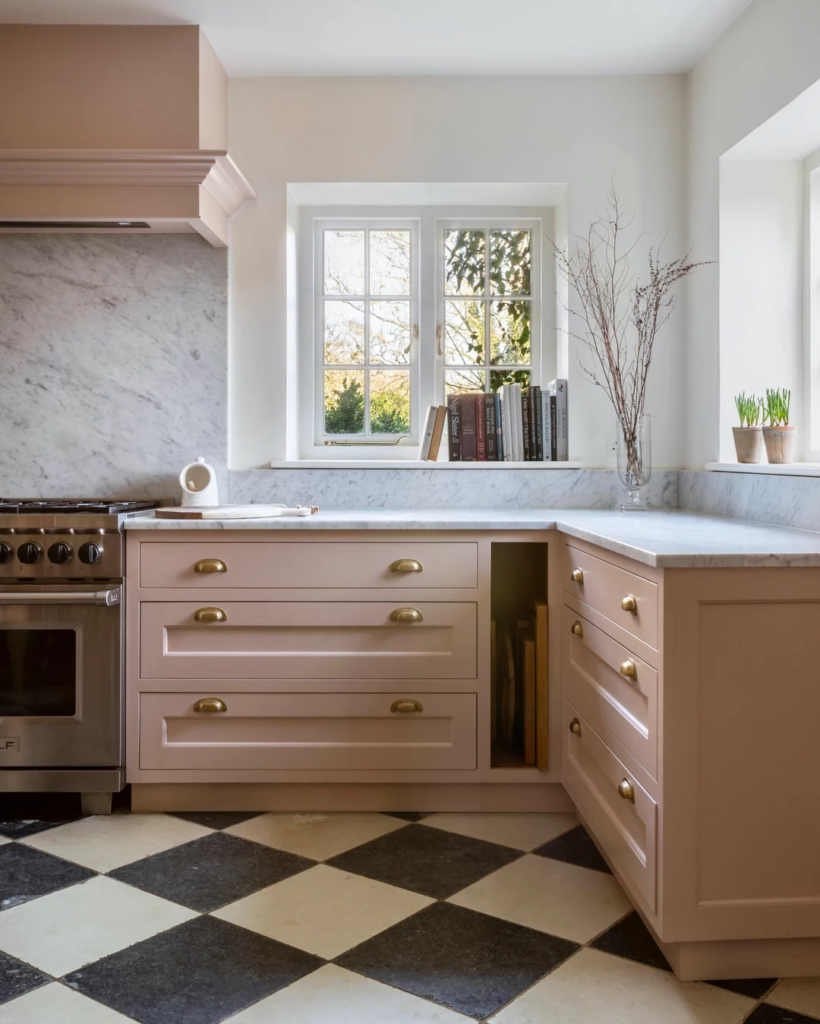
Edgecomb Gray by Sherwin Williams (aka Baby Fawn)
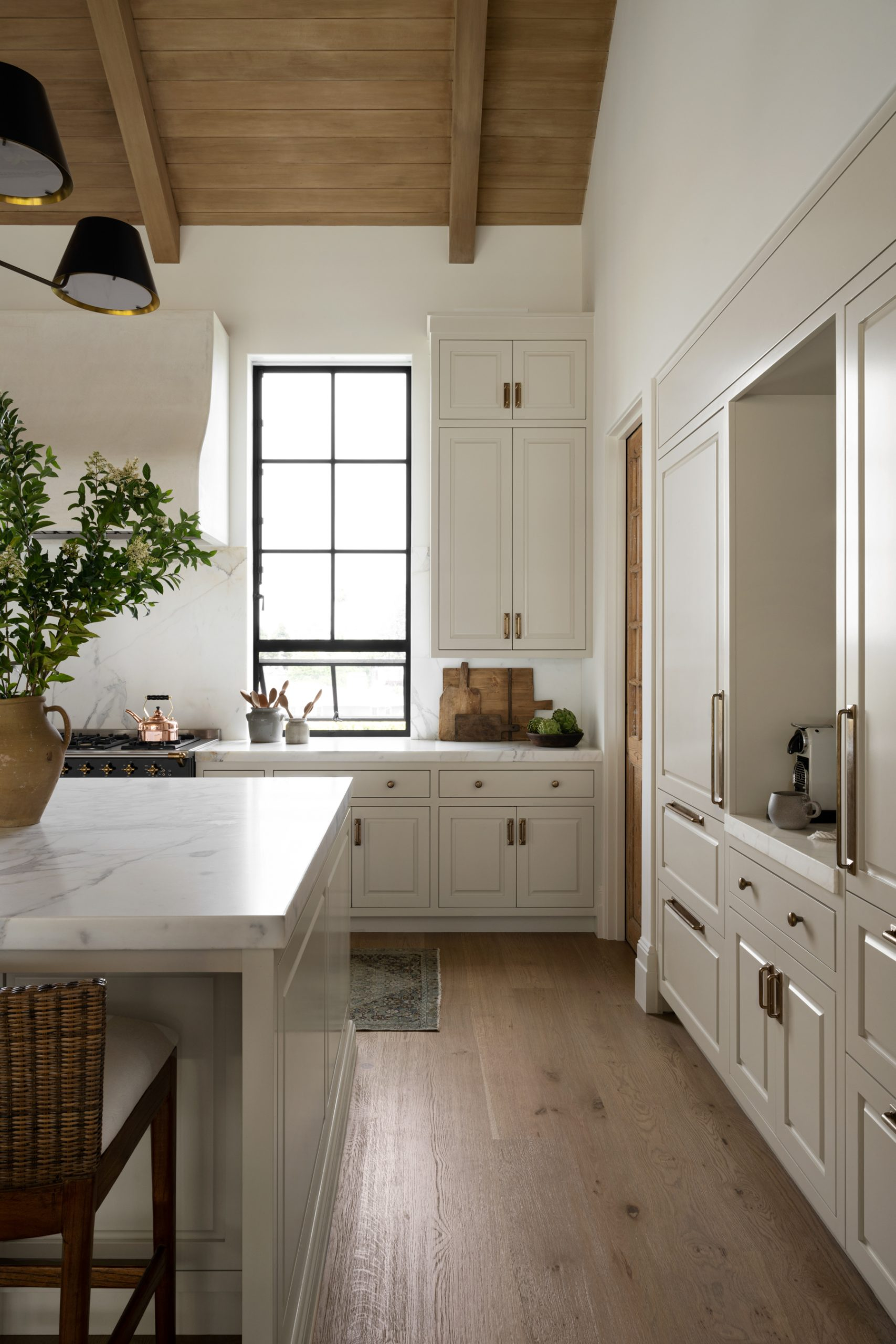
Beige cabinets have been called the new white kitchen cabinets, and I have to say I’m in agreement. This neutral color brings an understated warmth. Benjamin Moore describes this color as “a go-to neutral that can refresh a space, while providing a warm, welcoming feeling.”
Edgecomb Gray (also known as Baby Fawn) is one of the most beloved neutral, off-white paint colors out there. In year’s past, this has been a really popular wall color, as it is most often reads completely neutral without leaning too purple or too green. I’d call this a very light beige – think if creamy white married a light warm gray – and gives the perfect look for warm white cabinets.
This is warm, timeless choice – and most likely the color we are choosing to update our own white cabinets. This color is a great way to update your crisp white kitchen and bring in warmth without straying too far from neutral-loving roots.
We actually chose this color for our own kitchen cabinets! I wrote up a whole blog post on this specific color here.


Tallow by Farrow & Ball
Tallow is a soft, creamy yellow with just enough warmth to brighten a room without feeling overly colorful. It has the slightest hint of pink and yellow undertones that help it to feel creamy rather than buttery.
This feels like the perfect butter yellow if you aren’t FULLY committed to yellow.

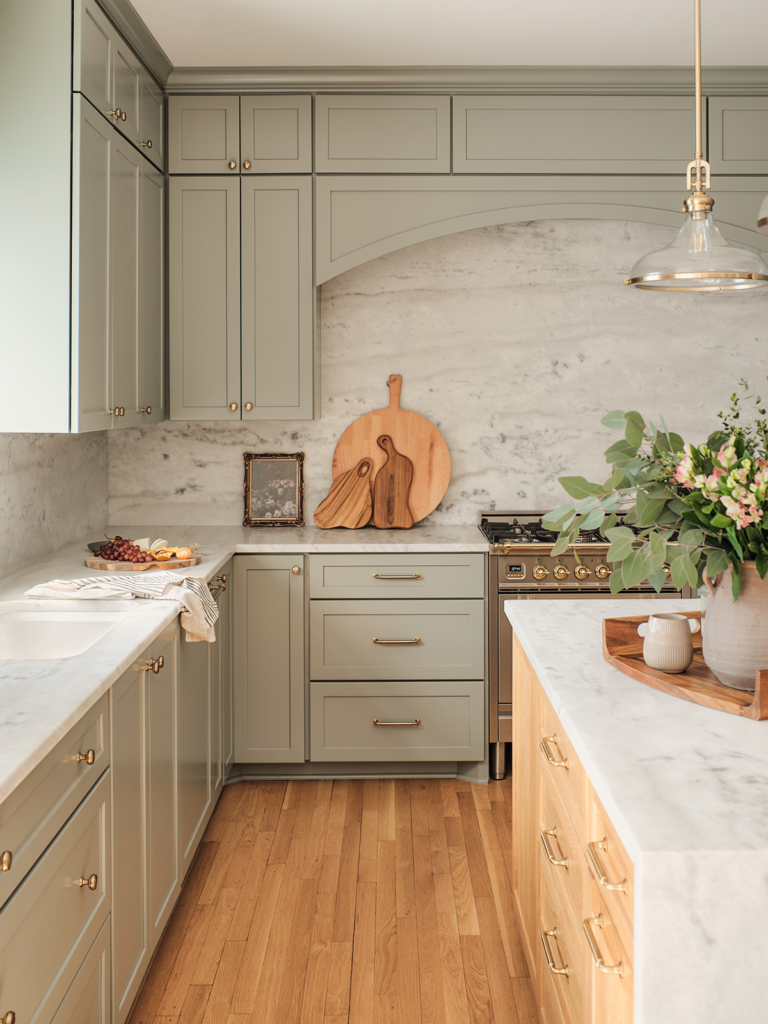
Ripe Olive and Pewter Green from Sherwin Williams (50/50 mix)
I love that this mixture marries warm olive and dark green. It gives a “historic” but warm vibe in this modern kitchen design.
Having seen Pewter Green in person many times, I’d say this color mixture is pretty close, but while Pewter Green can have a bit of blue hue, this one leads more yellow green.
My opinion of green kitchens is that the earthiness of certain green paints (like this one) lend themselves to being timeless and versatile. A great option and perfect shade to for the color lover that still wants to remain somewhat neutral.

Pigeon by Farrow & Ball
Pigeon is one of those chameleon colors that pairs well with a variety of neutrals. I’ve seen the color itself range anywhere from light blue, to gray, to green. Farrow & Ball describes Pigeon as a “cosy and nostalgic blue grey.”
The varying hue of Pigeon really gives this paint color so much interest and sophistication. Your cabinets will stand out without being overpowering in your space.
A custom color mix that closely resembles Mount Etna by Sherwin Williams
There is something about a deep blue/green cabinet color that adds so much depth to a space. Sherwin Williams describes Mt. Etna as an ashy blue with slate gray and green undertones. I also love how this color really makes the brass hardware pop.
This color, or something similar, is a great color when you feel like going bold but still seeking a classic look. It’s also a great choice when you’re in need an “anchor” or focal point for your kitchen.

Hay by Farrow and Ball
Speaking of beige paint colors – let’s talk about this warm, earthy one. Hay by Farrow and Ball reads yellow, there’s no getting around that. But it’s the warmest, earthiest, coziest yellow you’ve ever seen.
If you’re seeking the look of colorful cabinets and want to create a super inviting and welcoming kitchen, Hay just might be the right color for you.

Light Blue by Farrow & Ball

Dropcloth by Farrow & Ball
We talked Edgecomb Gray at the beginning of this blog post. Consider Drop Cloth by Farrow and Ball as Edgecomb Gray kicked up a few notches. It’s a true neutral, but this color is deeper and richer and will stand out more on kitchen cabinetry. If you’re looking for off-white cabinets with more pizzaz, this is it.
Farrow & Ball describes this cozy, classic color as “Neither too yellow, nor too grey, Drop Cloth is the traditional name for the indispensable painter’s dust sheet which this muted colour embodies.”
Setting Plaster by Farrow & Ball
Want to really shake things up? LOVE color but want to keep your kitchen feeling calm? Setting Plaster by Farrow & Ball might be the color you’re after.
We’ve been talking about beiges. This is a warm, pink beige or a “dusty pink” that will give your kitchen a soft and understated elegance.
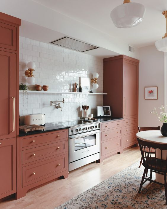
Reddened Earth by Sherwin Williams
Reddened Earth by Sherwin Williams is a rich, earthy reddish brown with warm tones that will instantly add charm to your kitchen.
Seeking a bold look that will showcase your personality? While many of the colors I’ve shared are colorful but subtle, this one is bold and unique!
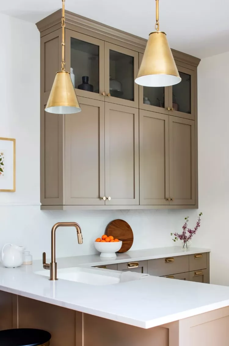
Mouse’s Back by Farrow & Ball
Mouse’s Back by Farrow & Ball is a warm, taupe-y gray. The right shade if you’re looking for something neutral yet bold. And while this color can definitely lend itself to an “old world” look, adding brass and clean accents will give it a modern look.
Farrow & Ball states that this color will “read greener when used on the walls of underlit rooms.” So if you have a kitchen with more shadows, this is something to consider. Although, this is not something I’d be upset about!
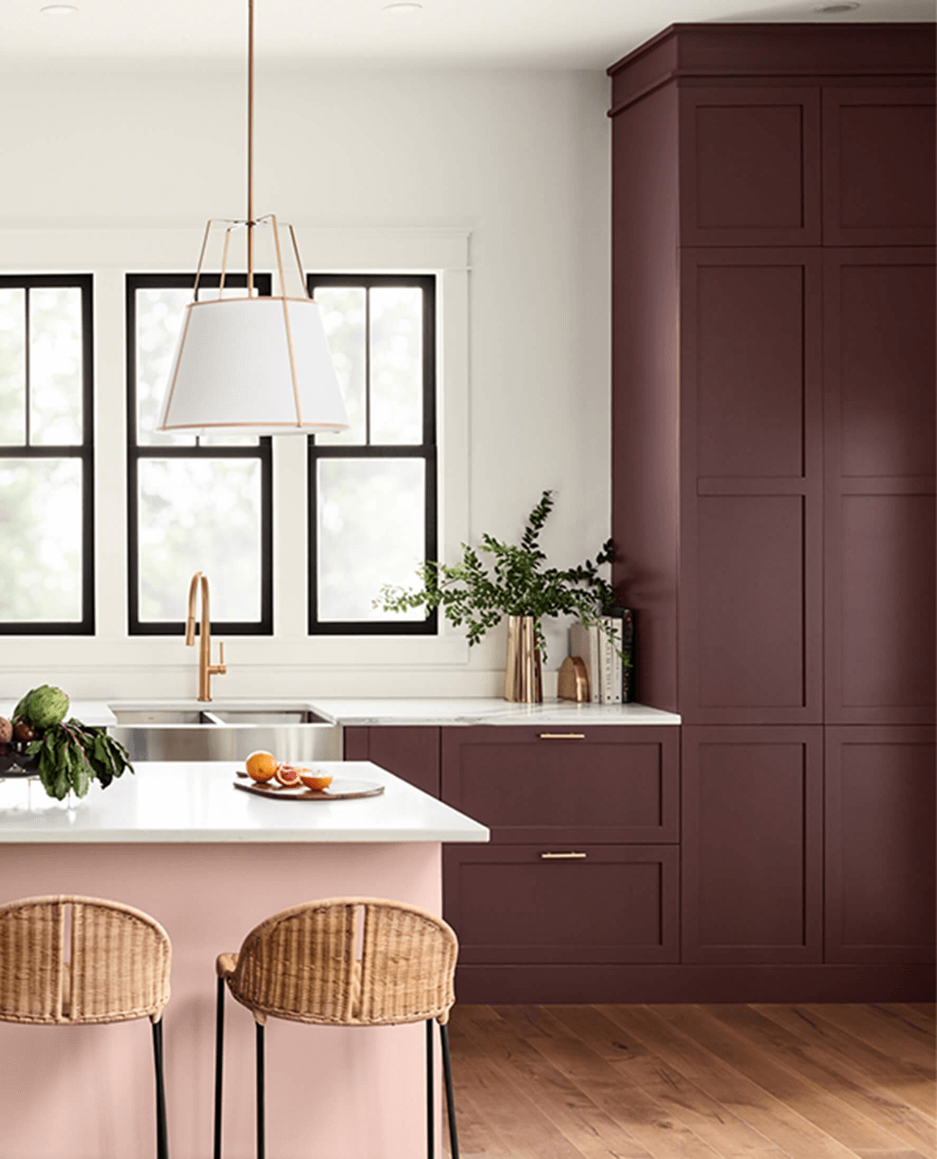
Carnelian by Sherwin Williams
Looking for something completely unique? According to Sherwin Williams, Carnelian is a “saturated violet with warm red undertones appears almost brown in some lighting and exudes a dark luster suggestive of mystery and romance.”
This is for the bold color lovers who are really after something statement-making and just downright fun. The example below is a prime example that when done correctly, your kitchen can be bold, FUN, and timeless.
I hope this round-up of kitchen cabinet colors that aren’t white sets you down the right path as you as you choose the perfect shade for your home!
YOU MAY ALSO BE INTERESTED IN:
Best Warm White Paint Colors for Your Kitchen
Moody Paint Color for Your Living Room
Best Mushroom Paint Colors for Kitchen Cabinets
PIN FOR LATER: