Best Paint Colors for an Open Floor Plan
This post may contain affiliate links, please review my disclosure policy.
Hey friends! Today we’re talking the best paint colors for an open floor plan! AKA one of the trickiest paint decisions you’ll make in your home!
When all of your main living spaces flow together, one paint color has a big job to do. It has to feel beautiful in your kitchen, cozy in your living room, welcoming in your dining room, and still look just as good as the light changes throughout the day.

I know FIRSTHAND how overwhelming this can be, as half of our home is one big room. After spending countless hours testing paint samples in our own home a couple of years back (you can see that post here), I quickly realized that the “perfect” color isn’t just about finding a pretty white or greige. It’s about finding a color that works with your home’s specific natural light, your flooring, and the overall feeling you want your home to have.
So if you’ve been dreaming of a warm, timeless home that feels connected from room to room, you’re in the right place. I’ve rounded up some of my favorite paint colors from Sherwin-Williams, Benjamin Moore, and Farrow & Ball that work beautifully with open floor plans. Whether you’re looking for a soft warm white, a light neutral or creamy warm neutral, there’s something here for every style and color pallette.
So let’s get into the best paint colors for an open floor plan!
WHAT IS LRV AND WHY IS IT IMPORTANT?
Before we get into the paint colors, I’d like to quickly talk about LRV, or Light Reflectance Value. LRV. This number is measured on a scale from 0 to 100 and tells you just how much light a paint color reflects. A color with a higher LRV will look lighter and brighter, while a lower LRV will feel deeper and absorb more light. For example, before I really understood LRV, I chose Simply White by Benjamin Moore as our home paint color. It’s a warm white, and I thought it would give me a cozy, warm feeling in our home. HOWEVER, because of the very high LRV of Simply White, it created a ton of bright white light in our home that never felt cozy to me.
THAT being said, your paint’s LRV is especially important in an open floor plan because the same wall color can look completely different in different areas of your home as the natural light changes from one space to the next. Knowing the LRV can help you choose a color that feels warm and consistent throughout your home without becoming too dark, too bright, or washed out.
BRIGHT WARM WHITE PAINT COLORS:
If your goal is for your home to feel light, bright, and welcoming, this is the category I’d start with.
One thing I’ve learned after spending way too much time staring at paint swatches 😅 is that not all white paint is actually white. Some lean gray, some lean yellow, and some have just enough warmth to make a home feel cozy without looking cream.
For an open floor plan, I usually recommend sticking with warm whites over cooler whites. Since your main color is flowing through the entire space, it’s important to choose colors with similar undertones so your home has good visual flow.
These are three of my favorite bright warm whites.
Dover White by Sherwin Williams
LRV: 83
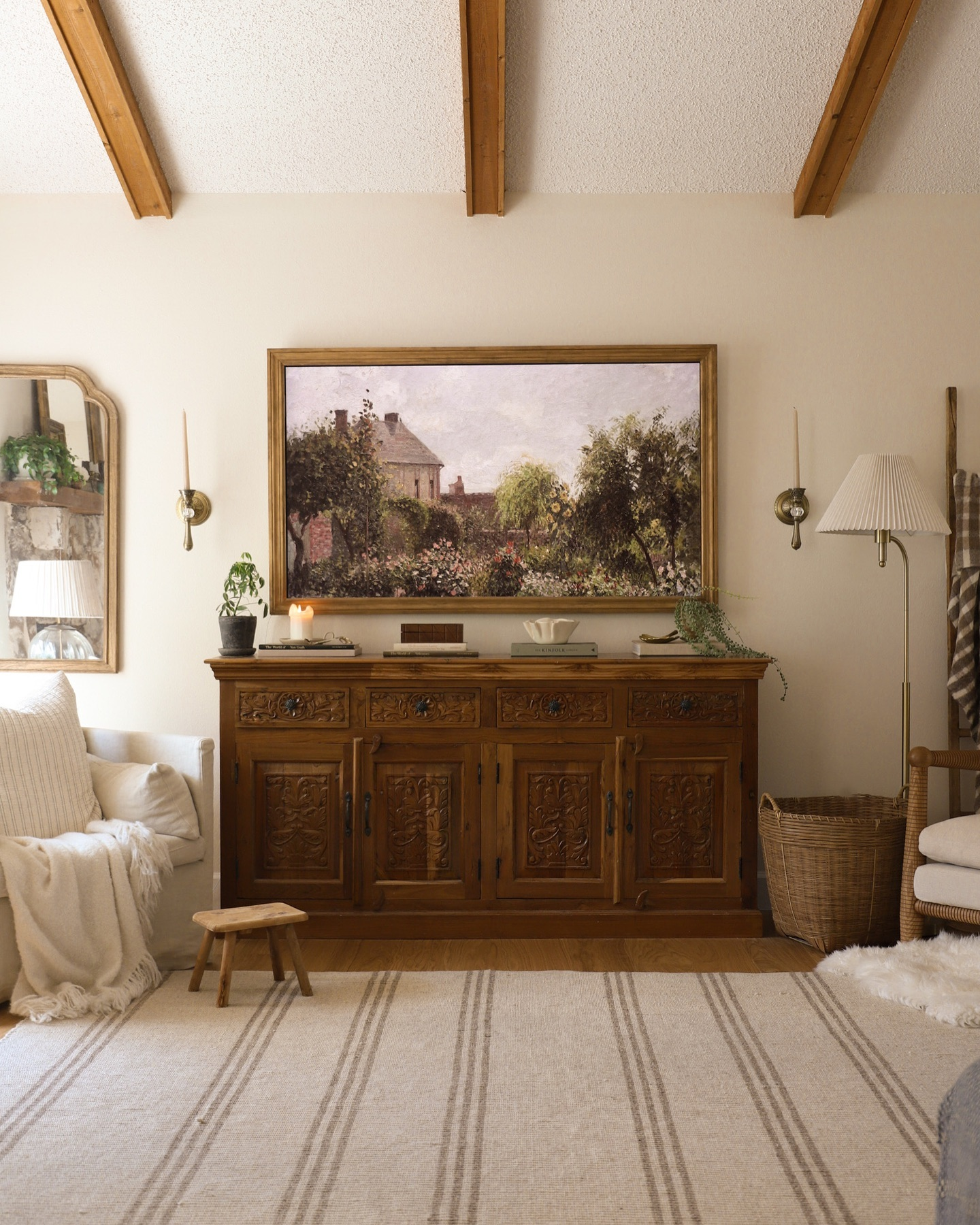
If you’ve been searching for a warm white that still feels bright and classic, Dover White is one to add to your list. This is one of the lightest colors I’ll be suggesting, making it a great option for open floor plans that need a bit more light while still feeling warm and inviting.
Unlike many crisp whites, Dover White has soft creamy yellow undertones. Those warm undertones help it feel welcoming instead of stark, which is why it’s been a favorite for traditional, cottage, and English-inspired homes for years.

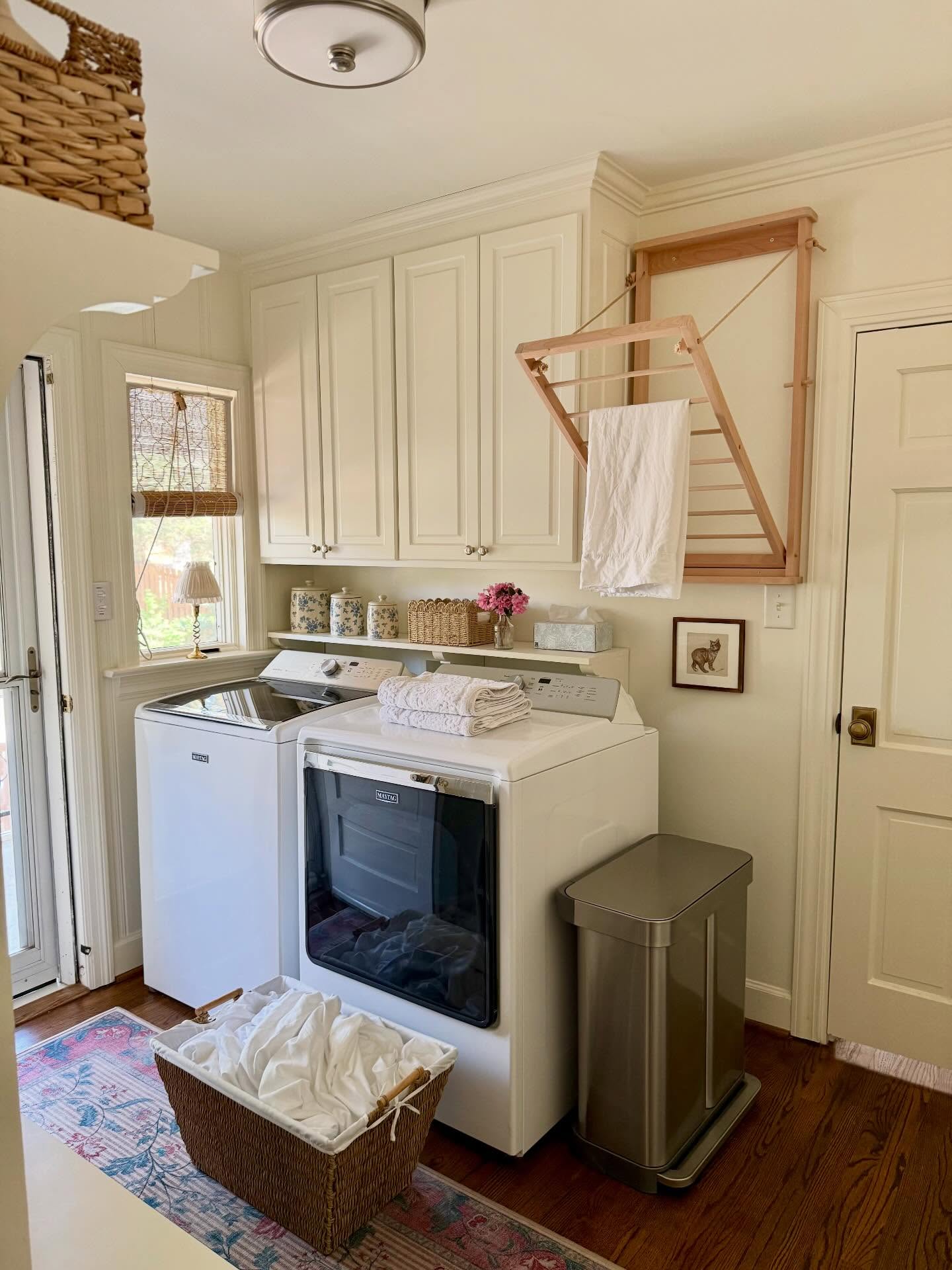
In an open-concept home, Dover White does a wonderful job of creating cohesion between rooms while reflecting natural light throughout the space. If your home has north-facing rooms or areas that tend to feel a little dark, this color can help brighten them without looking cold.
One thing to keep in mind is that Dover White’s warm undertones become more noticeable when paired with a bright white trim.

Greek Villa by Sherwin-Williams
LRV: 84
Greek Villa is ALMOST not a warm white, in my personal opinion. However, it doesn’t feel cold, gray, or too stark. It doesn’t have an obvious buttery quality, which makes it one of the easiest warm whites to decorate around.

With an LRV of 84, Greek Villa reflects just slightly more light than Dover White. In real life, that difference is subtle, but it does help Greek Villa feel a touch brighter, especially in rooms with lots of natural sunlight. Its undertones, however, are where this color really shines. Greek Villa has soft creamy undertones with a gentle beige warmth, but they’re not as in-your-face as Dover White. That’s one reason it works so beautifully in an open floor plan.
This color gives you that light, classic look without feeling sterile. If you’re nervous about choosing one paint color for your entire main level, Greek Villa is honestly one of the safest places to start. It’s warm enough to feel welcoming but neutral enough that it plays nicely with a wide variety of decorating styles.
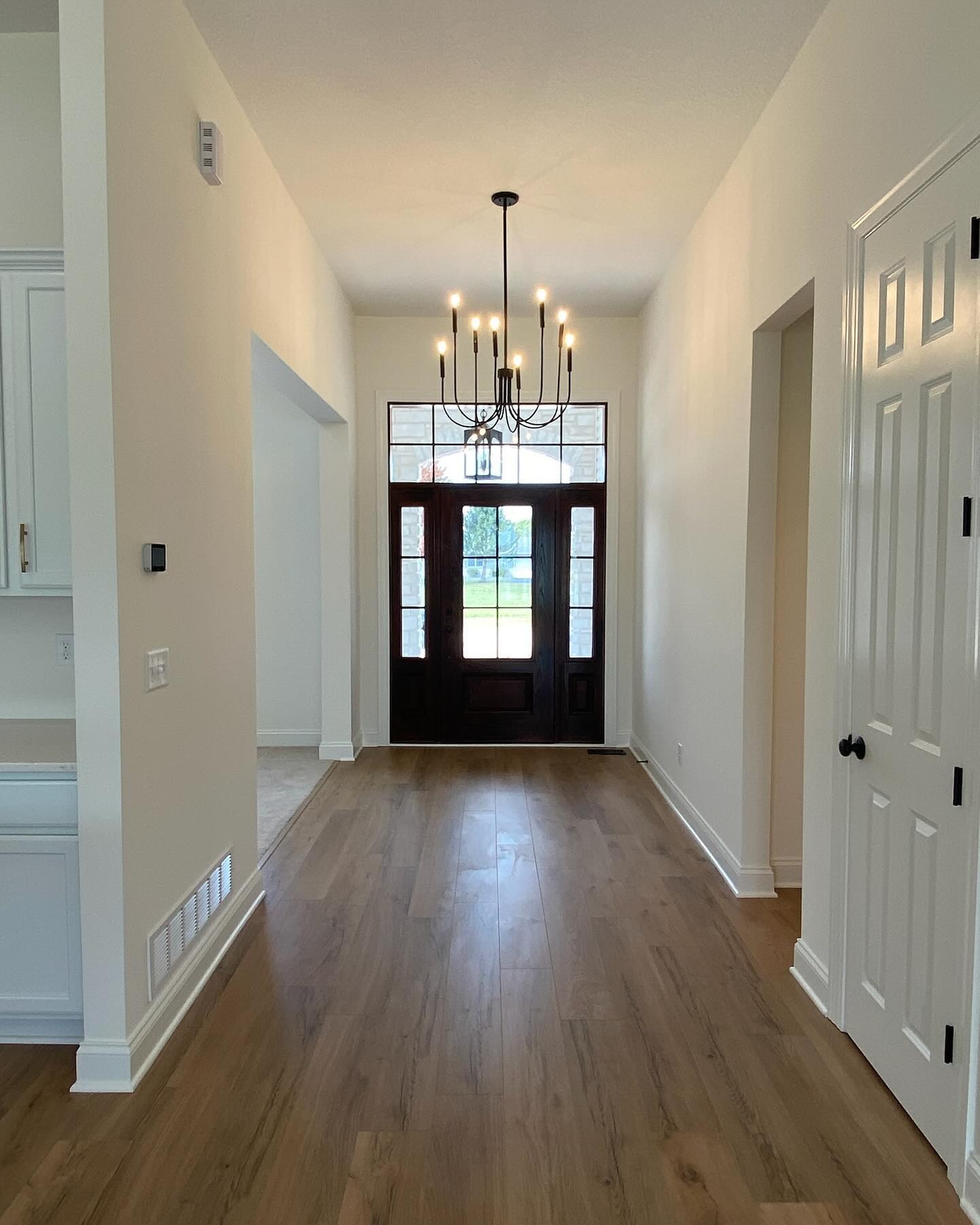
White Tie by Farrow & Ball
Approximate LRV: 86
White Tie is Dover White and Greek Villa’s warmer, elegant cousin. It’s technically the lightest color in Farrow & Ball’s yellow-based “Yellow Ground” family, which gives it an incredibly gentle warmth. The yellow undertones are there, but they’re subtle enough that most people just notice how inviting the room feels rather than seeing “yellow walls.”
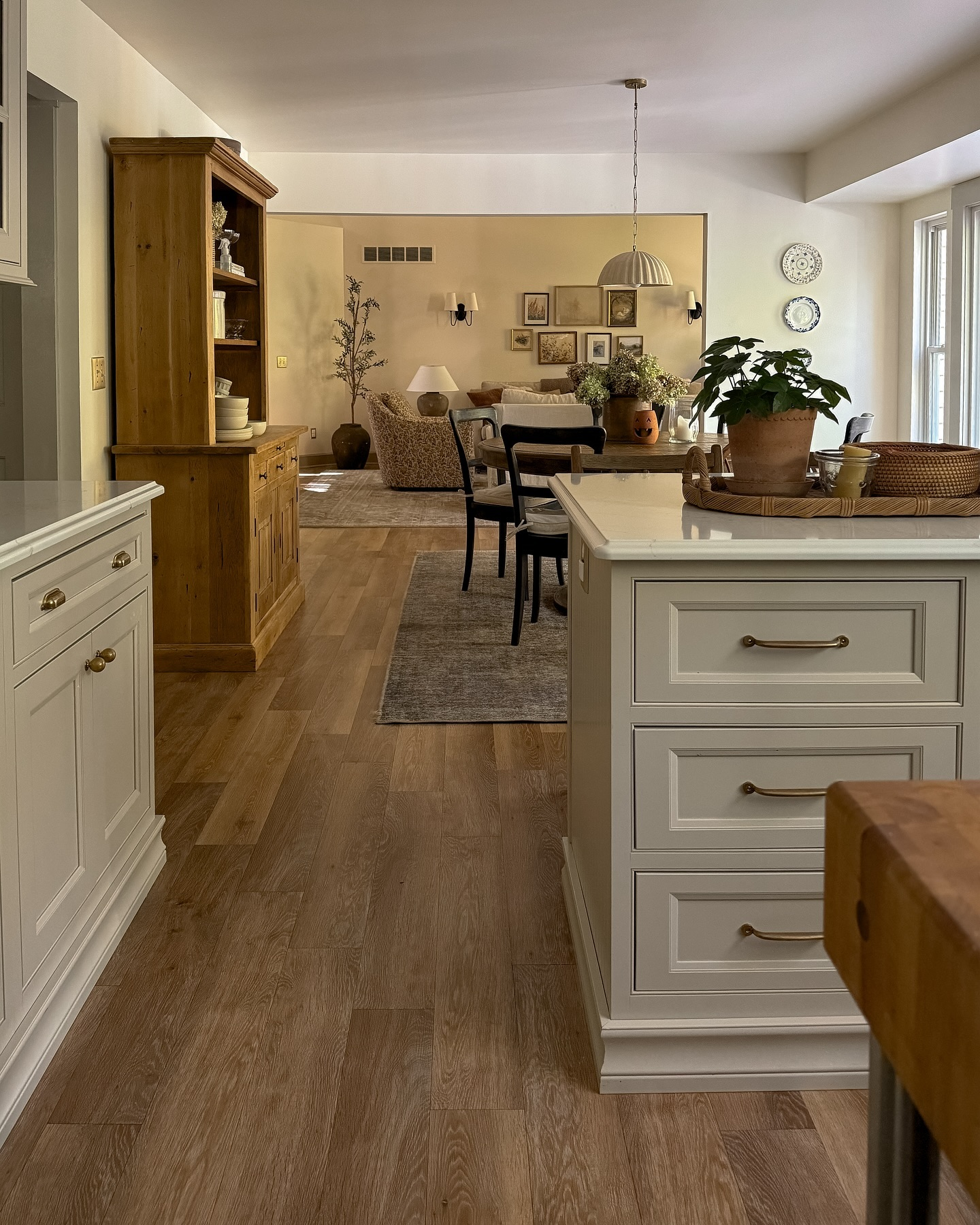
Because White Tie has such a high LRV, it reflects lots of natural light and can make an open floor plan feel wonderfully airy (but still SO warm). That’s especially helpful if your main living area doesn’t get consistent sunlight throughout the day.

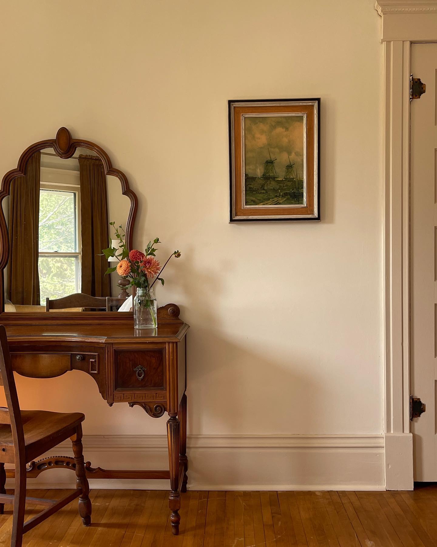
One thing I love about White Tie is how it changes with the light. In a bright, sun-filled room, it reads as a soft, creamy white. In the evening, it takes on a richer, candlelit warmth that makes a space feel especially cozy. This is a quality I really appreciate in an open floor plan since the walls are visible from so many different angles.
WARM GREIGE WHITES:
Okay, now onto warm greige whites! These are colors that sit somewhere between a white and a greige. They still feel light and airy, but they have just a little more depth than a traditional warm white. That extra depth helps soften an open floor plan and makes large spaces feel more grounded without making them feel dark. They’re also wonderful if you’re decorating open-concept homes with fewer walls, since they create a cohesive neutral base without feeling boring. We actually chose a warm greige for our home (we will discuss this next!)
One thing I especially love about these colors is how forgiving they are. Because they aren’t a true white, they tend to hide changing light a little better throughout the day. A sunny kitchen, shaded hallway, and cozy living room can all wear these colors beautifully without feeling like completely different paint colors.
Shoji White by Sherwin-Williams
LRV: 74
If I had to pick one paint color that perfectly bridges the gap between white and greige, it would probably be Shoji White. In fact…you’ll know exactly how much I love this one because it’s the color we chose for our own home! 😊 After testing what felt like a million paint samples, this was the one that finally felt “just right.” It gave us the warmth we were after without making our walls feel yellow, and it still feels timeless years later. You can see the blog post on how we chose the color HERE. And see the paint color in our home HERE.
This is a photo of Shoji White in our home.
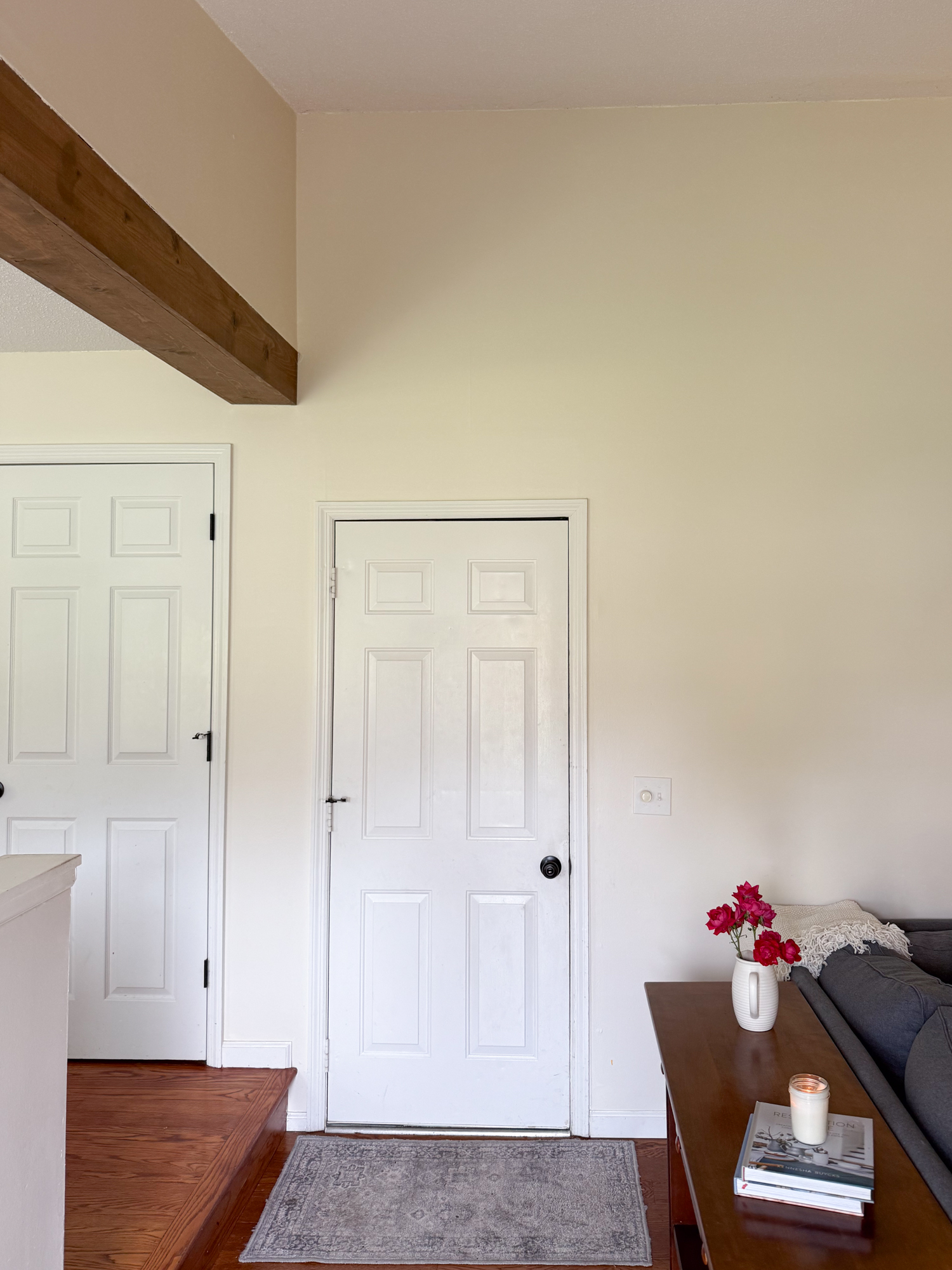
With an LRV of 74, Shoji White reflects a little less light than the bright whites we talked about above. That lower LRV gives it more body on the wall, so instead of reading as a crisp white, it has a soft, creamy appearance that adds just enough contrast against white trim. I LOVE how it looks against our Pure white doors and trims.
However, the undertones are what make Shoji White so special. It has a beautiful blend of warm greige, beige, and subtle taupe undertones. Depending on your lighting, you may notice one undertone a little more than another, but I’ve found it stays pretty balanced. It doesn’t suddenly flash yellow, pink, or green the way some warm neutrals can. That’s one of the biggest reasons I recommend it for an open floor plan!
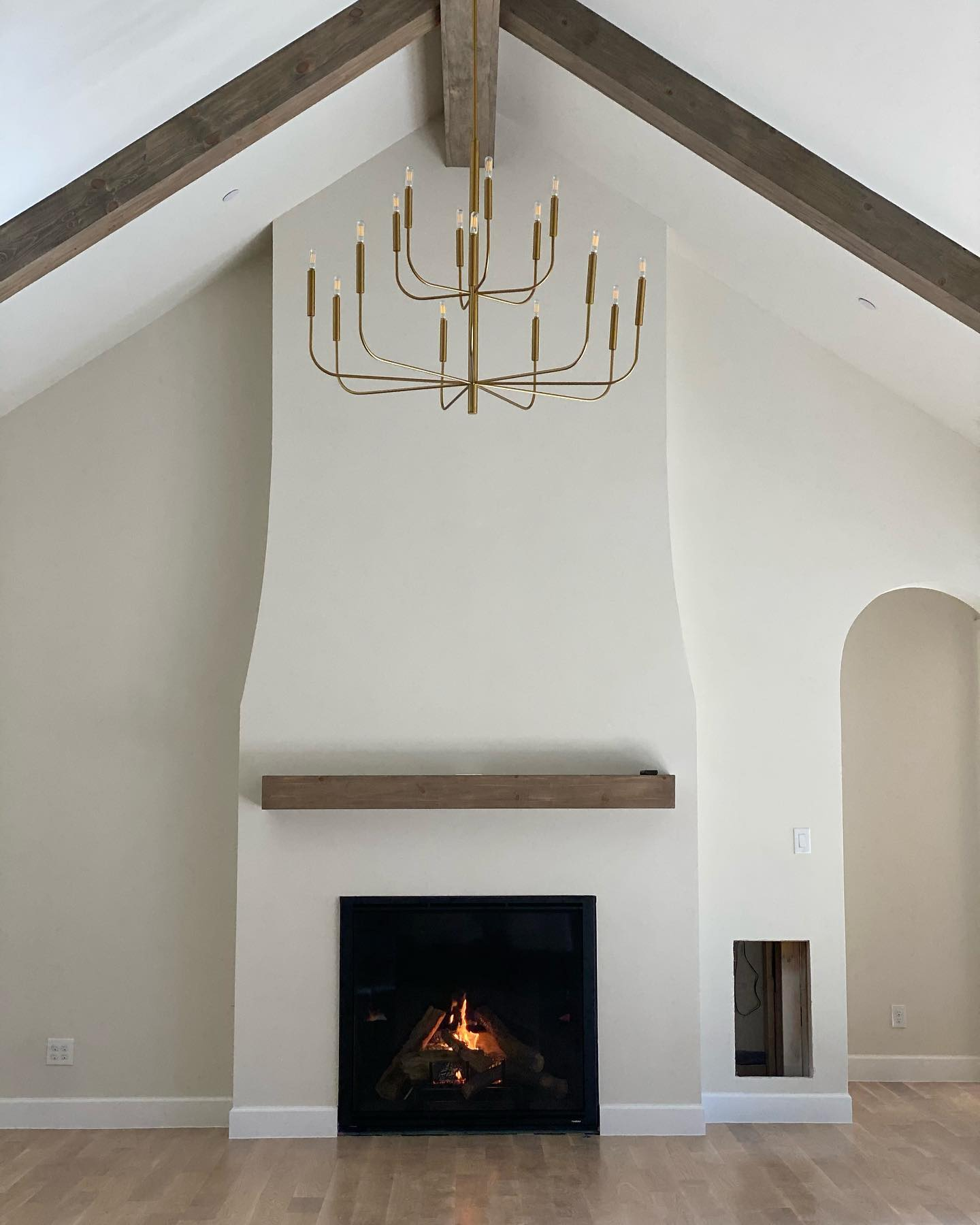

As the light changes throughout the day, Shoji White tends to warm neutral and consistent. In bright rooms, it feels soft and airy. In darker spaces, it simply becomes a little cozier instead of looking muddy or gray.
White Duck by Sherwin-Williams
LRV: 74
Although White Duck has almost the same LRV as Shoji White, don’t let that fool you. They don’t look identical on the wall. Shoji White tends to feel a little creamier with soft taupe and beige undertones, while White Duck is slightly more muted and neutral with just a hint of gray-green.
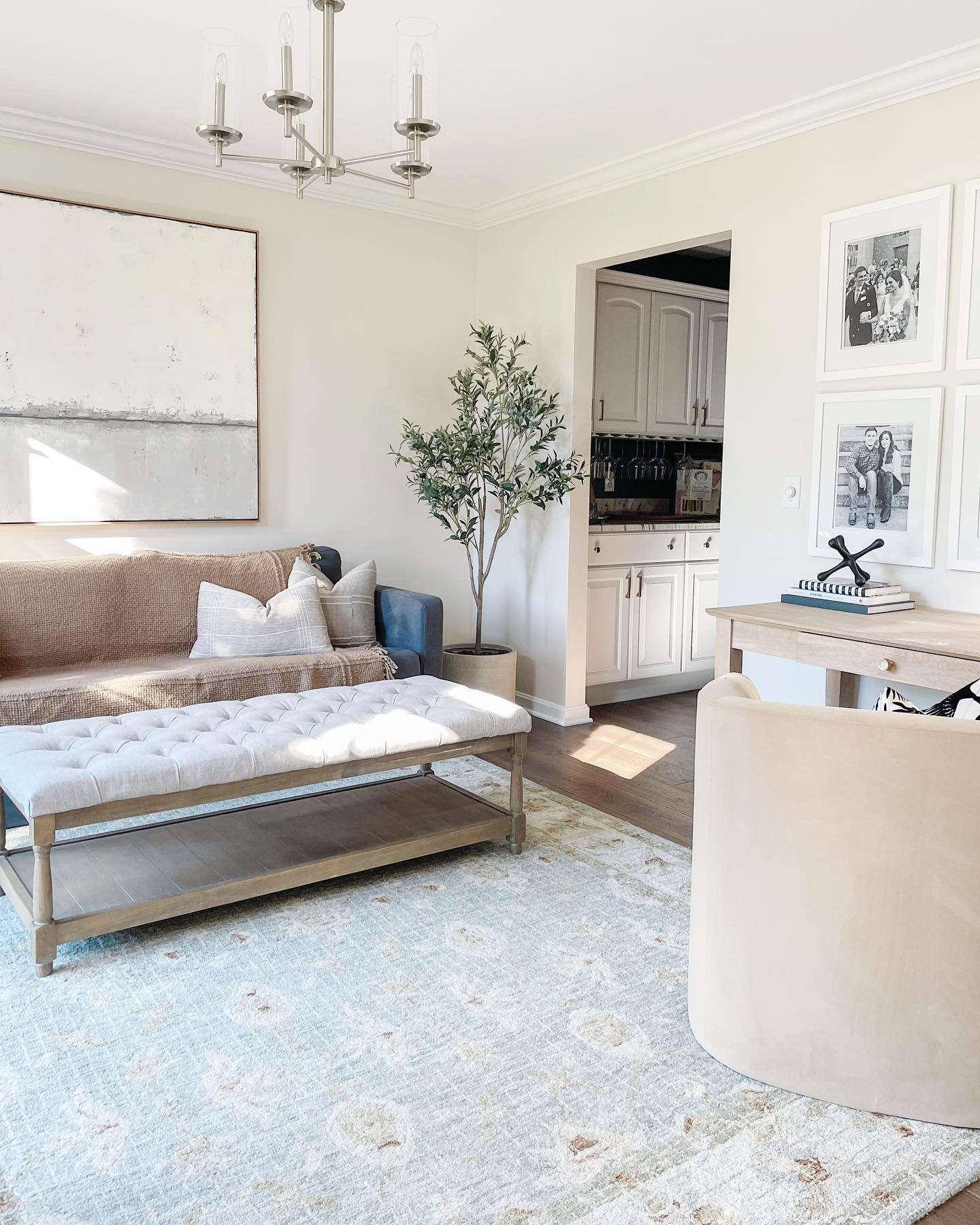
That’s why I always tell people not to choose a paint color based on LRV alone. Two colors can reflect the same amount of light while feeling completely different because of their undertones. White Duck works wonderfully in an open floor plan because it creates warmth without becoming overly creamy. It keeps connected spaces feeling relaxed and inviting, especially if your home already has warm flooring or natural wood furniture.
Neutral Ground by Sherwin-Williams
LRV: 70
With an LRV of 70, Neutral Ground is the deepest color in this section, which means it reflects a little less light than Shoji White or White Duck. That extra depth gives it a richer, more grounded appearance without making the room feel noticeably darker. Neutral Ground has warm beige undertones with a subtle greige influence. It’s a beautifully balanced neutral that avoids feeling overly yellow while still bringing plenty of warmth to a space. I think this is where Neutral Ground really shines in an open floor plan.
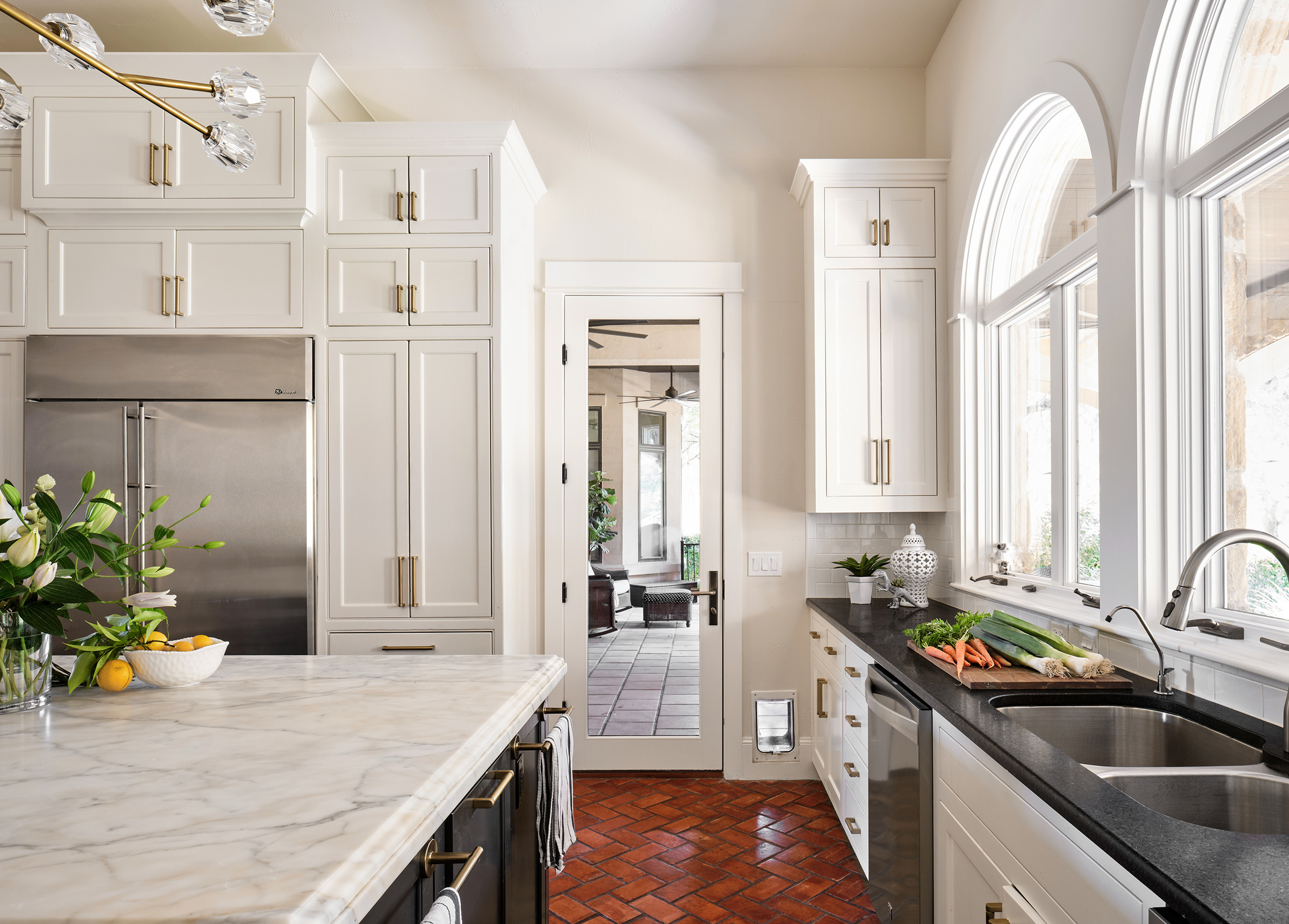
Large, connected homes can sometimes feel a little too open or even echoey. Because Neutral Ground has slightly more depth, it helps define an open area while giving the space a warm, grounded feel. It creates a cozy backdrop that makes open concept living feel a little more intimate.

If your home has a lot of natural light and you’re worried that a bright white might feel washed out, Neutral Ground is a great option to consider.
CREAMY WHITE PAINT COLORS:
Over the last several years, we’ve seen homeowners move away from all the stark, bright whites and gravitate toward softer neutrals that make a large space feel lived in while still keeping the open space bright. Creamy whites do exactly that. They still keep an open floor plan feeling light, but they add a richness that makes large spaces feel welcoming instead of cold.
That doesn’t mean every creamy white is right for every home, though! Since these colors have stronger undertones than the warm whites we looked at earlier, I’d definitely recommend sampling them in several different rooms before committing. The amount of natural light your home gets, and even your flooring or countertops, can make a creamy white lean more yellow, beige, or tan than you expected.
Let’s take a look at three of my favorites creamy whites.
Swiss Coffee by Benjamin Moore
LRV: 81.91
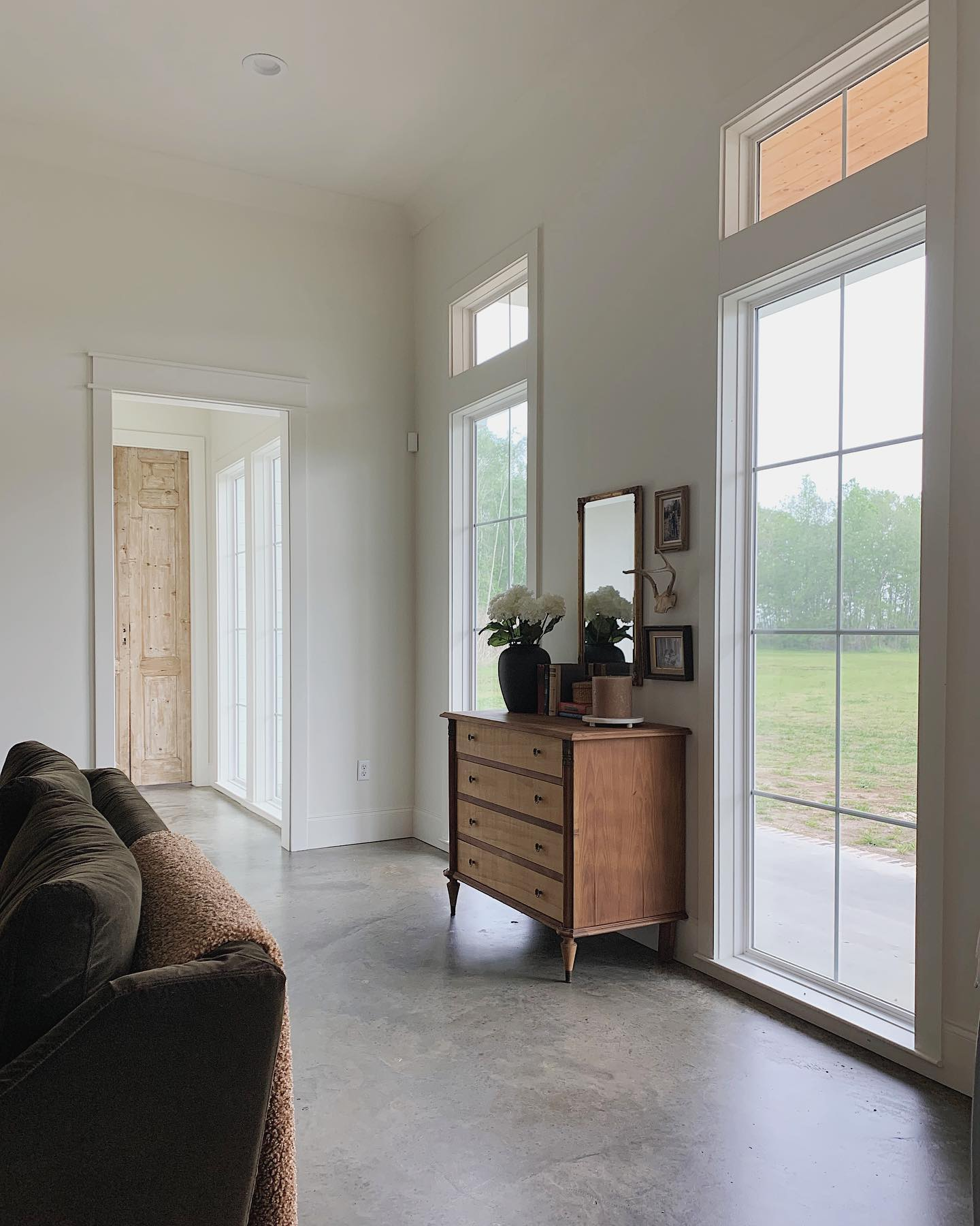
Swiss Coffee has earned its reputation as one of Benjamin Moore’s most-loved whites, and I get it! If you’re looking for a paint color that instantly softens a room without leaning too hard into yellow, this is it. With an LRV of 81.91, Swiss Coffee also reflects a great amount of light. Even though it sits firmly in the creamy white category, it still helps an open floor plan feel bright and spacious rather than heavy.

It has a creamy yellow undertone with a subtle hint of beige, giving it a warmth that’s noticeable without feeling overpowering. Compared to Dover White, I find Swiss Coffee feels a little softer and more muted, which is one reason it has become such a favorite among designers.
Linen White by Benjamin Moore
LRV: 78.43
Linen White is one of those colors that doesn’t always get the attention of Swiss Coffee, but I honestly think it deserves more love. It has a little more depth than Swiss Coffee, which gives the walls a richer, cozier appearance without making them feel dark.


With an LRV of 78.43, Linen White also reflects slightly less light than Swiss Coffee. That difference isn’t dramatic, but it does give the color a fuller presence on the wall, especially in larger rooms. HOWEVER, its undertones are what make it so beautiful. Linen White has warm cream and beige undertones (sometimes peachy) that create a soft, elegant warmth.
One reason I like Linen White in an open floor plan is that it helps visually soften large spaces. Homes with high ceilings or wide-open layouts can sometimes feel a little cold or echoey, and Linen White adds just enough warmth to make everything feel more intimate.
Navajo White by Sherwin-Williams
LRV: 72
If there’s one color in this section that fully embraces warmth, it’s Navajo White. This is NOT the paint color to choose if you’re hoping for a crisp white wall. Instead, Navajo White creates an unmistakably cozy atmosphere that feels especially beautiful in traditional homes. You WILL see warmth, and a little yellow.
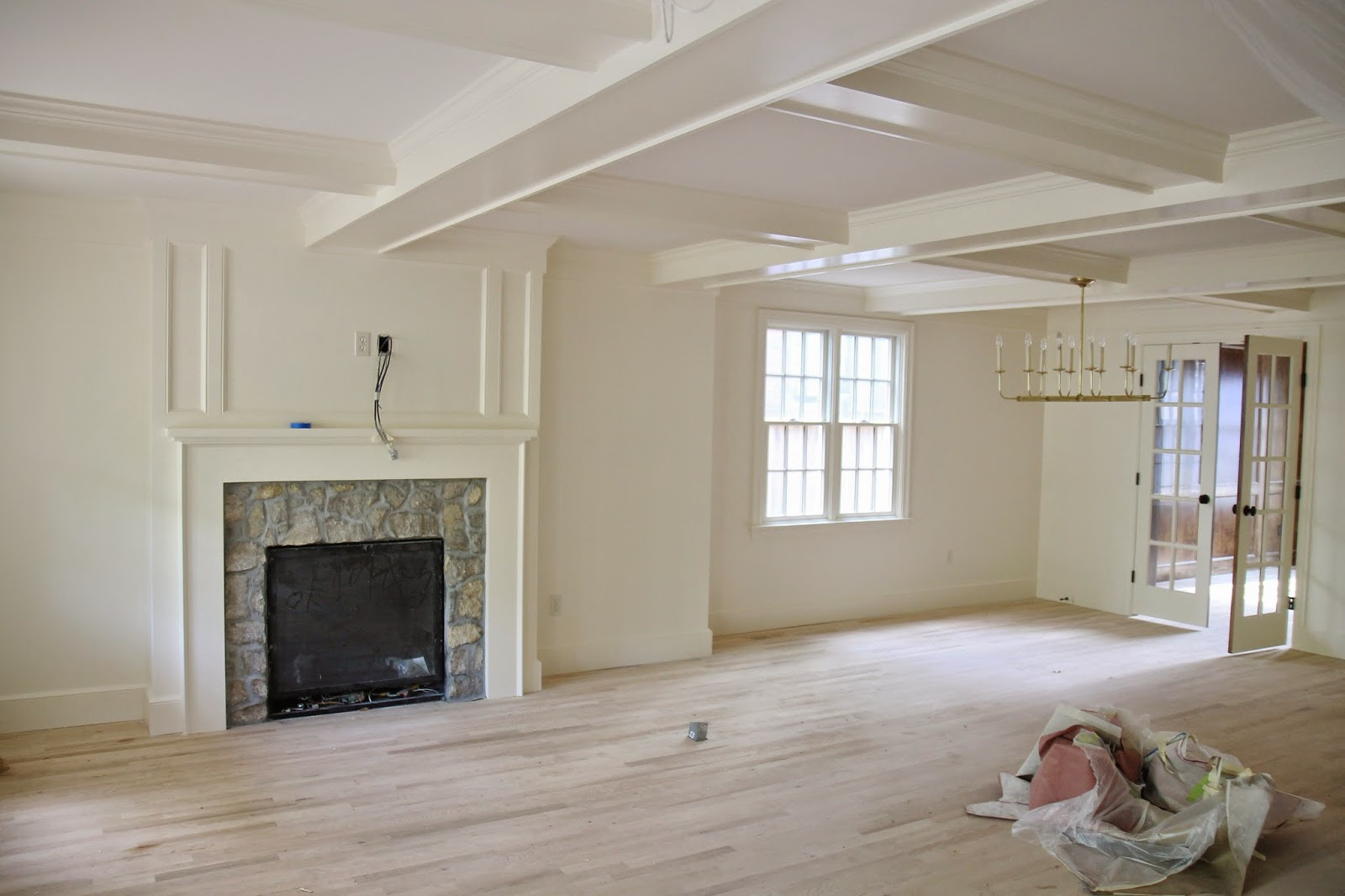
With an LRV of 72, it’s noticeably deeper than the other creamy whites we’ve discussed. It still reflects a good amount of light, but it has enough depth to give walls a soft, enveloping quality that can make a large open floor plan feel much more comfortable.

Navajo White has rich creamy beige undertones with a noticeable yellow warmth. Those undertones are exactly what give it its signature look, but they’re also why I always recommend sampling it in your own home.
Slipper Satin by Farrow & Ball
LRV: 72
Slipper Satin is one of those paint colors that feels effortlessly elegant. It has a softness that’s difficult to describe until you see it in person. Instead of feeling bright white, it wraps a room in a gentle warmth that feels refined and lived in.
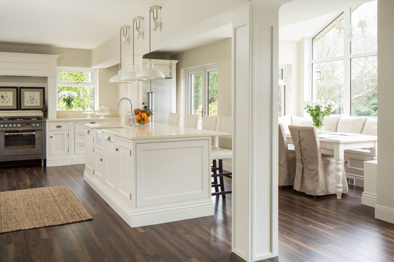
With an LRV of 72, Slipper Satin reflects a generous amount of light while still having enough body to create depth across the walls. Farrow & Ball describes Slipper Satin as a warm neutral inspired by the color of traditional satin slippers. It has soft cream, beige, and muted greige undertones, giving it a wonderfully understated warmth.

One of my favorite things about Slipper Satin is how gracefully it moves through an open floor plan. Rather than changing dramatically from one room to another, it tends to feel consistently soft throughout the day. Morning light brings out its creamy warmth, while evening light makes it feel especially cozy.
SOFT GREIGE PAINT COLORS:
If you can’t decide between white, beige, or gray…welcome to the club. 😊 Greige has become one of the most popular neutral paint families for a reason. It gives you the softness of beige with just enough gray to keep the color feeling balanced and timeless.
I especially love greiges in an open floor plan because they help define a large space without making it feel closed in. If your home has soaring ceilings or one large living area that flows from room to room, these colors can make everything feel a little more grounded while still keeping that light, airy feeling.
Like any neutral, though, undertones matter. Greiges can lean pink, green, purple, or beige depending on the lighting and surrounding finishes, so sampling is always worth the extra effort. Here are three beautiful options that have proven themselves time and time again!
Edgecomb Gray by Benjamin Moore
LRV: 63.09
Don’t let the name fool you! Edgecomb Gray isn’t what most people think of when they hear the word “gray.” In fact, I’d describe it as one of the warmest, most approachable greiges Benjamin Moore makes. It has just enough gray to keep it feeling neutral, but plenty of beige warmth to make a home feel cozy instead of cold.
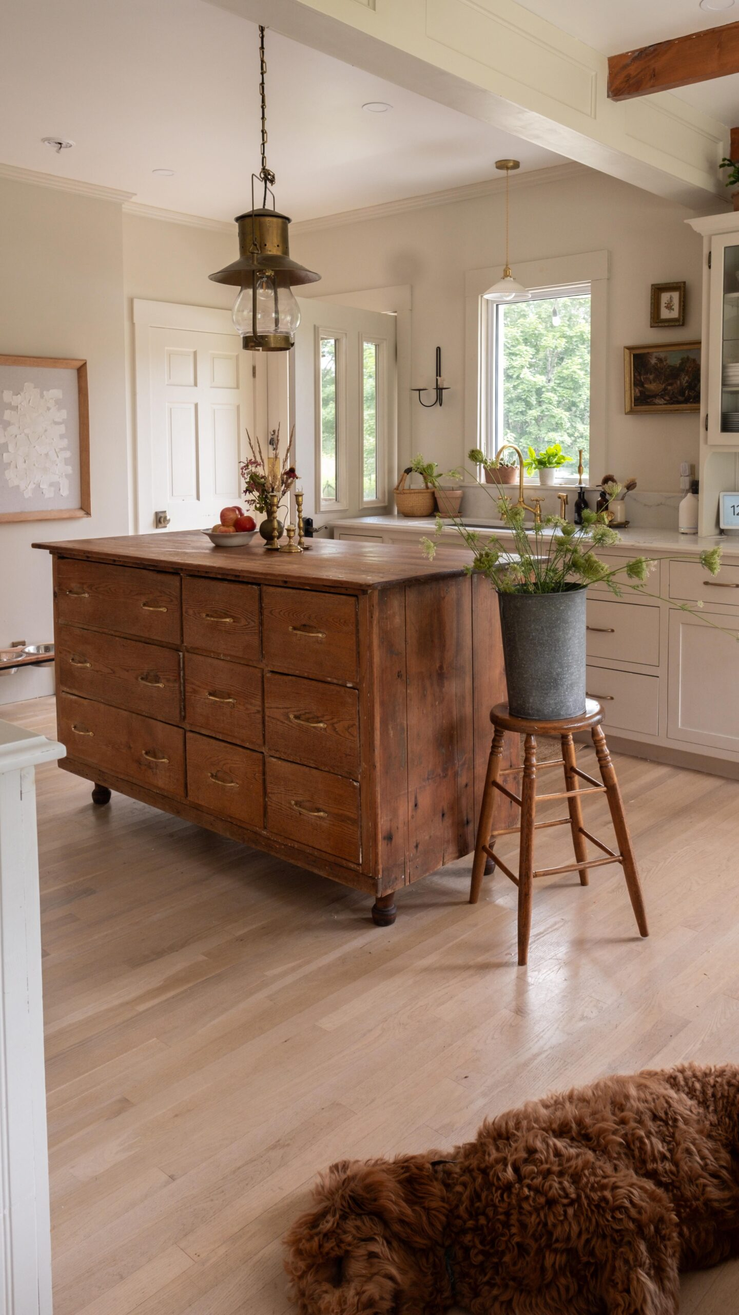

With an LRV of 63.09, Edgecomb Gray has noticeably more depth than the creamy whites we’ve talked about so far. It won’t reflect quite as much light, but it also won’t wash out in bright rooms the way lighter colors sometimes can. Instead, it gives your walls a soft, elegant presence that still feels open.
As for the undertones, Edgecomb Gray has warm beige undertones with subtle gray influences. Depending on the light, you may notice one a little more than the other, but overall it’s an incredibly balanced color. It doesn’t usually swing dramatically yellow or cool, which is one of the reasons it’s been a favorite for so many years.
I think Edgecomb Gray works beautifully in an open floor plan because it creates visual continuity without feeling flat. In bright rooms, it looks soft and warm. In darker areas, it develops a little more richness instead of turning muddy. That consistency is exactly what you want when one paint color is carrying your eye from the kitchen all the way into the living room.
Pale Oak by Benjamin Moore
LRV: 69.8
If Edgecomb Gray is the cozy older sister, Pale Oak is the light, airy one. Pale Oak has become one of Benjamin Moore’s most recommended whole-house paint colors because it’s incredibly soft and versatile. It has enough warmth to feel inviting, but it still reads much lighter than many greiges.

With an LRV of 69.89, Pale Oak reflects noticeably more light than Edgecomb Gray, making it a wonderful choice if you’re looking for something that keeps your open floor plan feeling bright while still adding a little warmth.
Pale Oak has soft greige undertones with gentle beige and slight pink-violet influences. Now, before that scares you away, let me explain! 😊 Those pink-violet undertones are usually very subtle and tend to show up only in certain lighting conditions. Most of the time, Pale Oak simply reads as a warm, sophisticated greige. And because it’s so balanced, Pale Oak transitions beautifully from room to room. It doesn’t feel stark in sunny spaces, nor does it become overly heavy in darker ones. That’s exactly why it’s such a popular choice for open floor plans.

School House White by Farrow & Ball
Approximate LRV: 74
Despite its name, Schoolhouse White isn’t a bright white paint at all. In fact, it’s one of those colors that’s a little difficult to describe until you see it on the wall. It sits somewhere between a warm white, a greige, and a very soft beige, giving it a depth that feels incredibly natural.

With an approximate LRV of 74, School House White reflects a good amount of light while still bringing more character than a traditional white paint. It feels airy without disappearing, making it an excellent choice for homeowners who want a little more warmth and depth throughout an open floor plan.
One of the things that makes School House White so special is its undertones. It has soft greige, beige, and muted taupe undertones that shift gently throughout the day. In bright natural light, it often reads as a warm, relaxed off-white. As the sun begins to set, it develops a richer, cozier appearance that gives a room an effortlessly lived-in feel.

Because Schoolhouse White already has a little depth, it doesn’t rely on bright sunlight to look its best. Instead, it creates a smooth transition from one room to the next, helping every space feel connected even when the lighting changes dramatically. Kitchens, dining rooms, hallways, and living rooms all feel like they belong together instead of looking like separate spaces.
WHY I LOVE NEUTRALS:
If your walls are acting as a blank canvas, you don’t have to be afraid to bring in personality with accent colors, throw pillows, artwork, or even accent walls in one of your family rooms. Keeping your main color neutral doesn’t mean your home has to feel boring. Sometimes those little pops of color are what give a home the most visual interest!
If there is one thing I hope you take away from this post, it’s this…there really isn’t one “perfect” paint color for every open floor plan. Every home is different. I know firsthand how overwhelming it can feel trying to narrow it down. I can’t even tell you how many paint samples I’ve brought home over the years! 😅 But every sample taught me something, and each one got me a little closer to finding the color that felt right for our home.
If you’re feeling stuck, I’d encourage you to narrow your favorites down to two or three colors, order samples from Samplize, and stick them on every room in your open floor plan. Check them in the morning, the afternoon, and again at night. You’d be surprised how differently they can look throughout the day!
I hope this round-up for the best paint colors for an open floor plan helps make the decision just a little easier. If you end up painting your home with one of these colors, I’d love to hear which one you chose! And if you have a favorite whole-house paint color that isn’t on this list, leave it in the comments below. I always love discovering new favorites!
Until next time,
Courtney
SAVE PIN FOR LATER: