Popular Butter Yellow Paint Colors
This post may contain affiliate links, please review my disclosure policy.

Hey friends! Today I will be comparing 12 popular butter yellow paint colors and discussing how to choose the right one for your space!
If you’ve been on social media lately, you’ve probably noticed that butter yellow is having a MOMENT, and I am absolutely here for every bit of it. It’s warm. It’s cozy. It makes every room feel happier! But when I started looking for the perfect butter yellow paint color to add to my own home, I quickly realized there are SO many different shades (from soft cream to RICH yellows). And many of them look incredibly similar online.
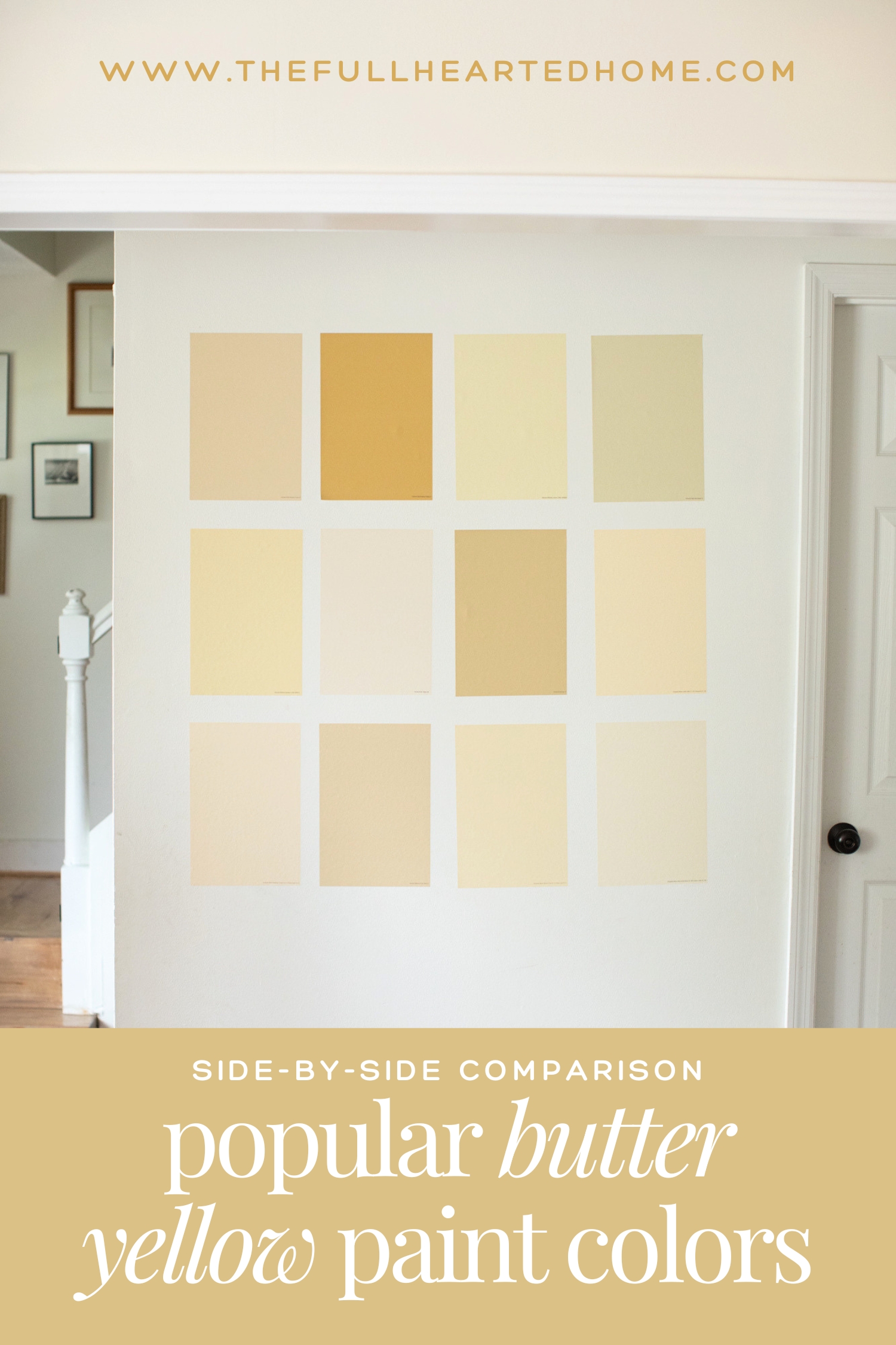
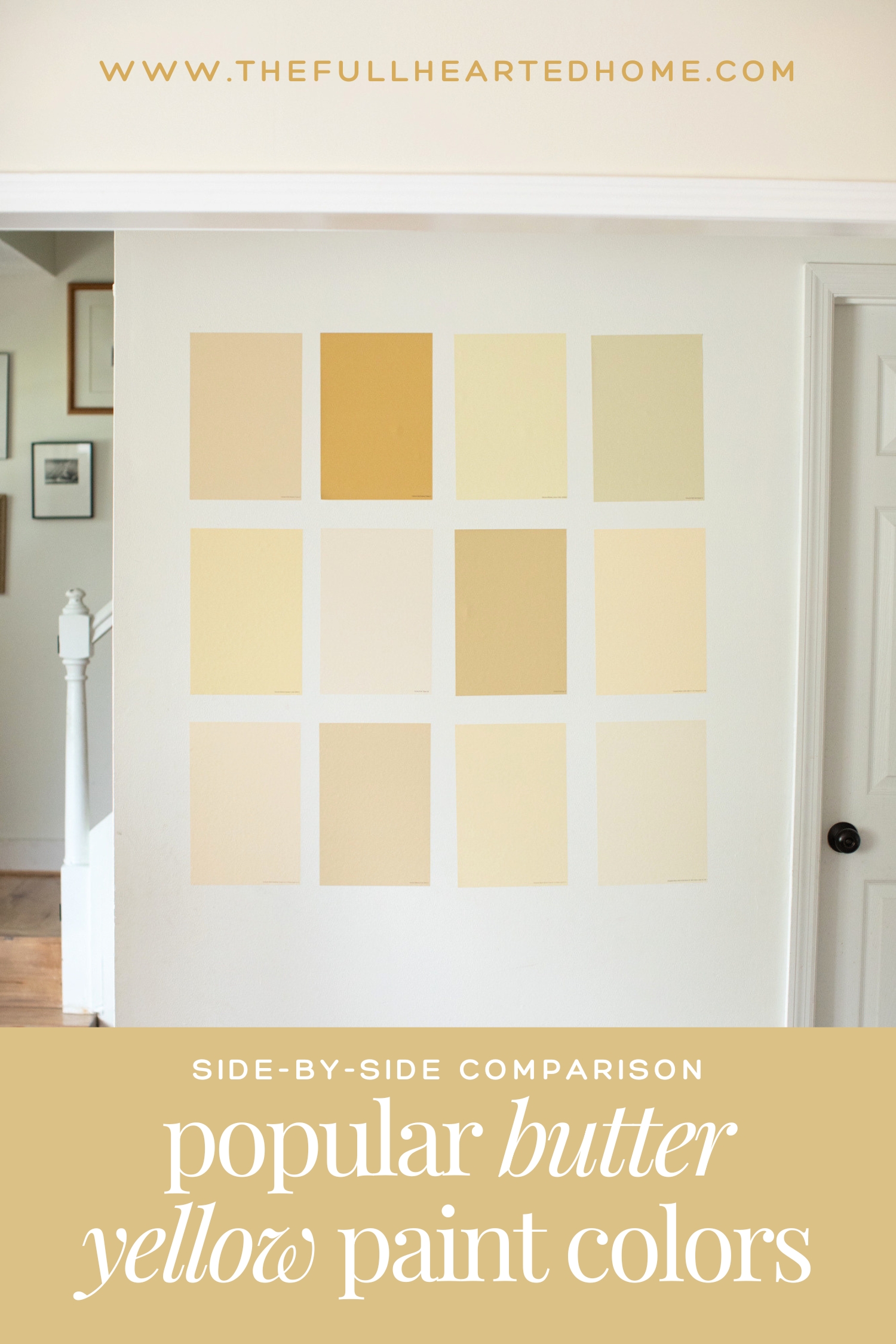
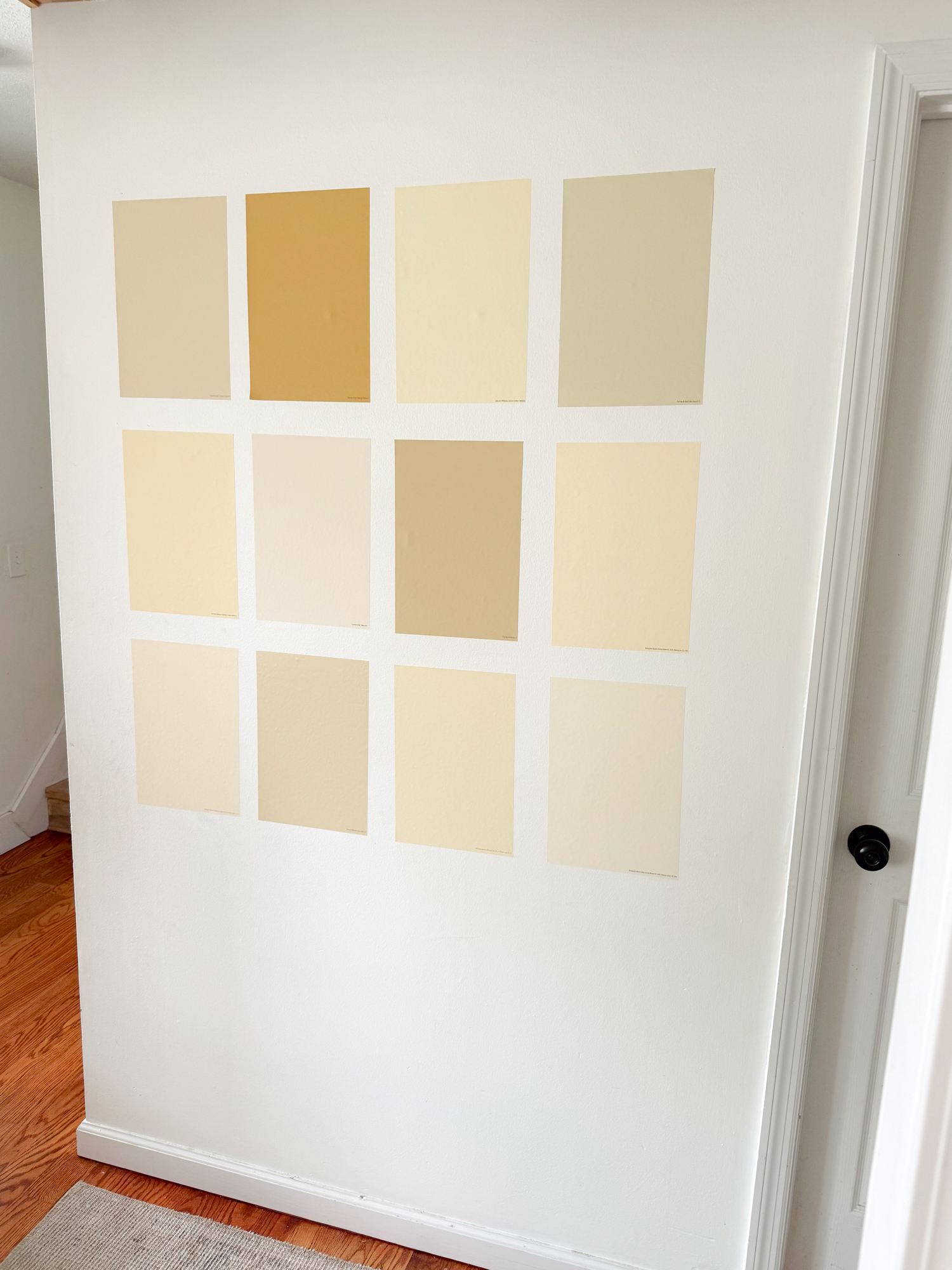
So, I went ahead and ordered peel-and-stick samples of some of the most popular butter yellow paint colors and put them side by side on my wall to make comparing them as easy as possible. Seeing them together made a huge difference for me, and my hope is that it will for you too!
If you’re trying to narrow down the perfect shade of buttery yellow paint for your home, you’ve come to the right place. I’ll show you how each color compares, what undertones to watch for, and how they look in real rooms. Whether you’re looking for a pale yellow, a creamy yellow, or one of the richer yellow paint colors trending this year, I’ve got you covered!
I also have a quick decision guide at the bottom of this post to help you find your perfect butter yellow!
Why order peel-and-stick paint samples?
As with every paint project in our home, I order peel-and-stick paint samples from Samplize so I can move them from room to room and see how each color looks throughout the day. This is hands-down my biggest tip when choosing paint! Seeing these colors in your own home and in different amounts of natural light is the best way to find the right shade.
Lighting changes everything, and a color you love in the morning can look completely different by evening. Plus, with three little kids running around, I love that there’s no messy paint to brush on the walls. I can stick the samples up, move them around, swap them out as I narrow down my favorites, and peel them off when I’m done. Even better is that they ship overnight and arrive the next day! Because let’s be honest… once I’ve decided I need to paint a room, I needed those samples YESTERDAY 😉
What is LRV and why is it important?
LRV (Light Reflectance Value) is a fancy way of measuring how light or dark a paint color is. Higher LRVs reflect more light and feel brighter and airier, while lower LRVs create a richer, cozier look. LRV plays a huge role in how a paint color affects the overall room feel! Do not underestimate the power of LRV, as it will help you compare similar colors and understand why one butter yellow feels soft and barely there while another feels much deeper and more saturated.
I’ve included the LRV for every color in this roundup, as I believe it’s necessary for comparing them and choosing the right shade for your home!
12 Popular Butter Yellow Paint Colors:
These colors are set against Simply White by Benjamin Moore walls with Pure White trim. Every sample was photographed on the same wall, in the same lighting, so you can compare them as accurately as possible.
Every paint color in this roundup will look a little different depending on your home’s unique lighting, but my hope is that comparing them on my wall makes it easier to see the differences in undertones and depth!
*Scroll to the bottom of this post to see each paint color labeled in one graphic.
1. Farrow’s Cream by Farrow & Ball
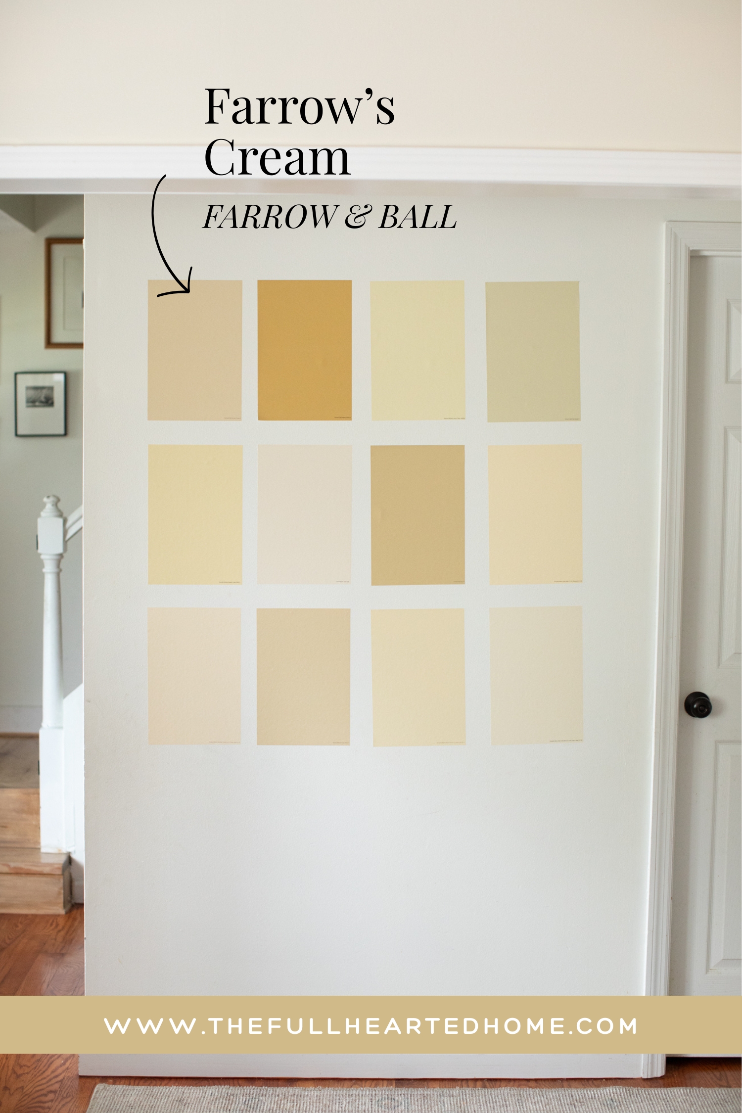

Farrow’s Cream is an understated butter yellow, and one of my personal top picks! It’s technically a traditional cream color and, in my opinion, can almost read tan. But when it covers a space, it gives a delicious buttery warmth. With an LRV of 84, it still feels light while also being noticeably warmer and richer than your typical white.
Farrow’s Cream has warm yellow and beige undertones, so it doesn’t lean *too* yellow. This one has a muted, aged quality that gives a space the warmth of butter yellow without the YELLOW, if that makes sense. I think this is a great choice for someone wanting a warm neutral without the commitment of yellow. I find it to be absolutely yummy in person!
2. Sudbury Yellow by Farrow & Ball
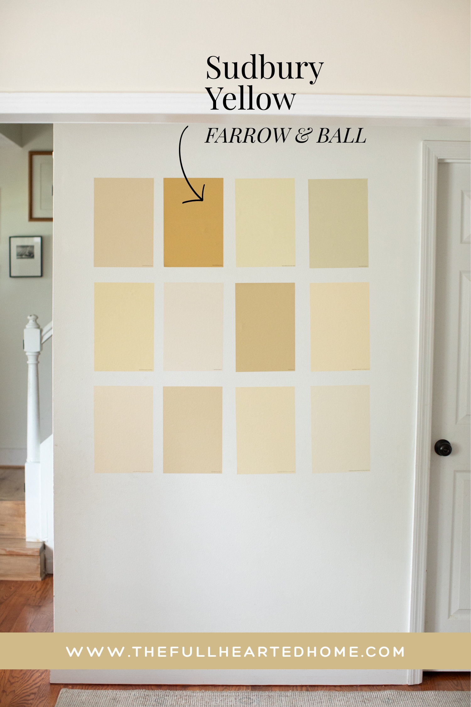

Sudbury Yellow is the color you want if you’re looking for a true yellow showstopper! It reads so happy and FUN. As you can see when it’s placed beside the other samples, this is by far the boldest and richest shade that I tried. With an LRV of 67, it’s noticeably deeper than the other colors, giving it a very cozy and saturated feel. Let’s just say, you won’t miss this one!
Sudbury Yellow has golden undertones that create a warm, sunny feel. I think this is a great choice if you want the color to be the focal point. But if you’re after a subtle hint of butter yellow, this probably isn’t it! Could be a great color for a reading nook, accent wall, cabinets, or anywhere you want a cheerful pop of color.
If you’re wanting a bold yellow with lots of happy character, Sudbury Yellow may be your color.
3. Lemon Chiffon by Sherwin Williams
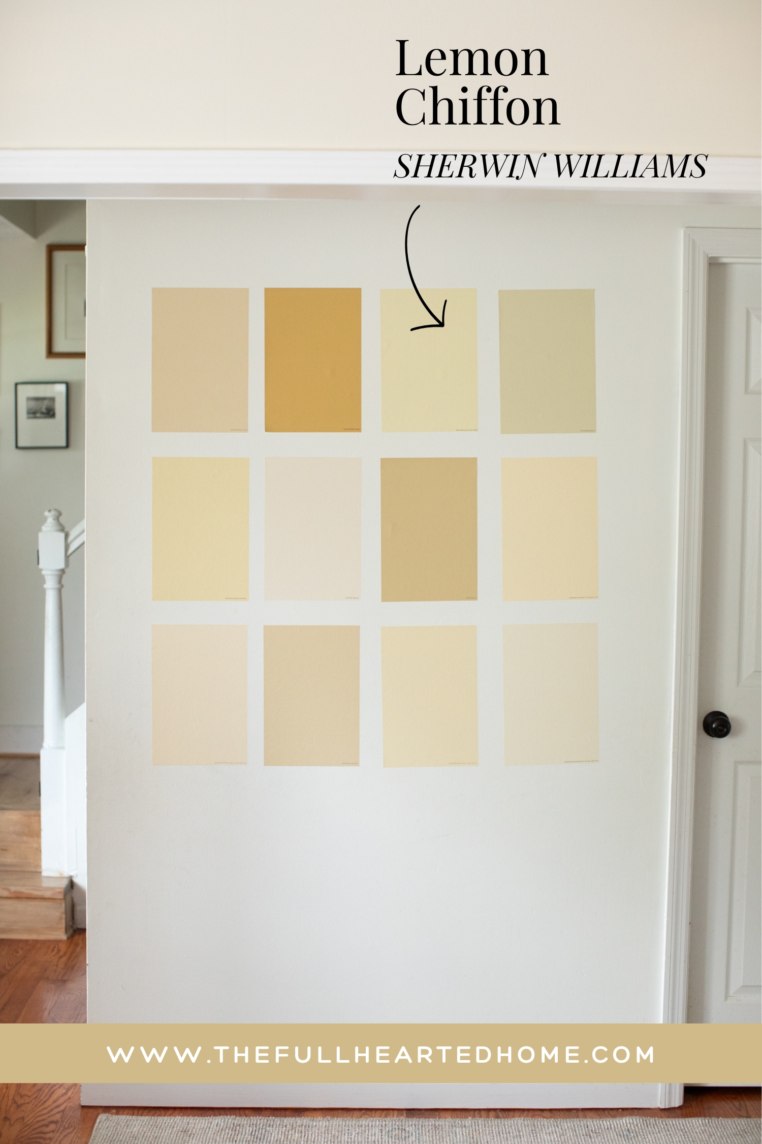
Lemon Chiffon gives me all the nostalgic feelings! Sherwin Williams describes it as a “sweet yellow,” and I’d say this nails it. With an LRV of 79, it’s a lighter, softer yellow and will give a beautiful yellow warmth without overwhelming a space. Its creamy, warm undertones make it feel very cheerful, airy, and welcoming. I personally think this one has a lot of vintage charm!
If you’re after a light, happy butter yellow, Lemon Chiffon just may be your color!
4. Pale Hound by Farrow & Ball
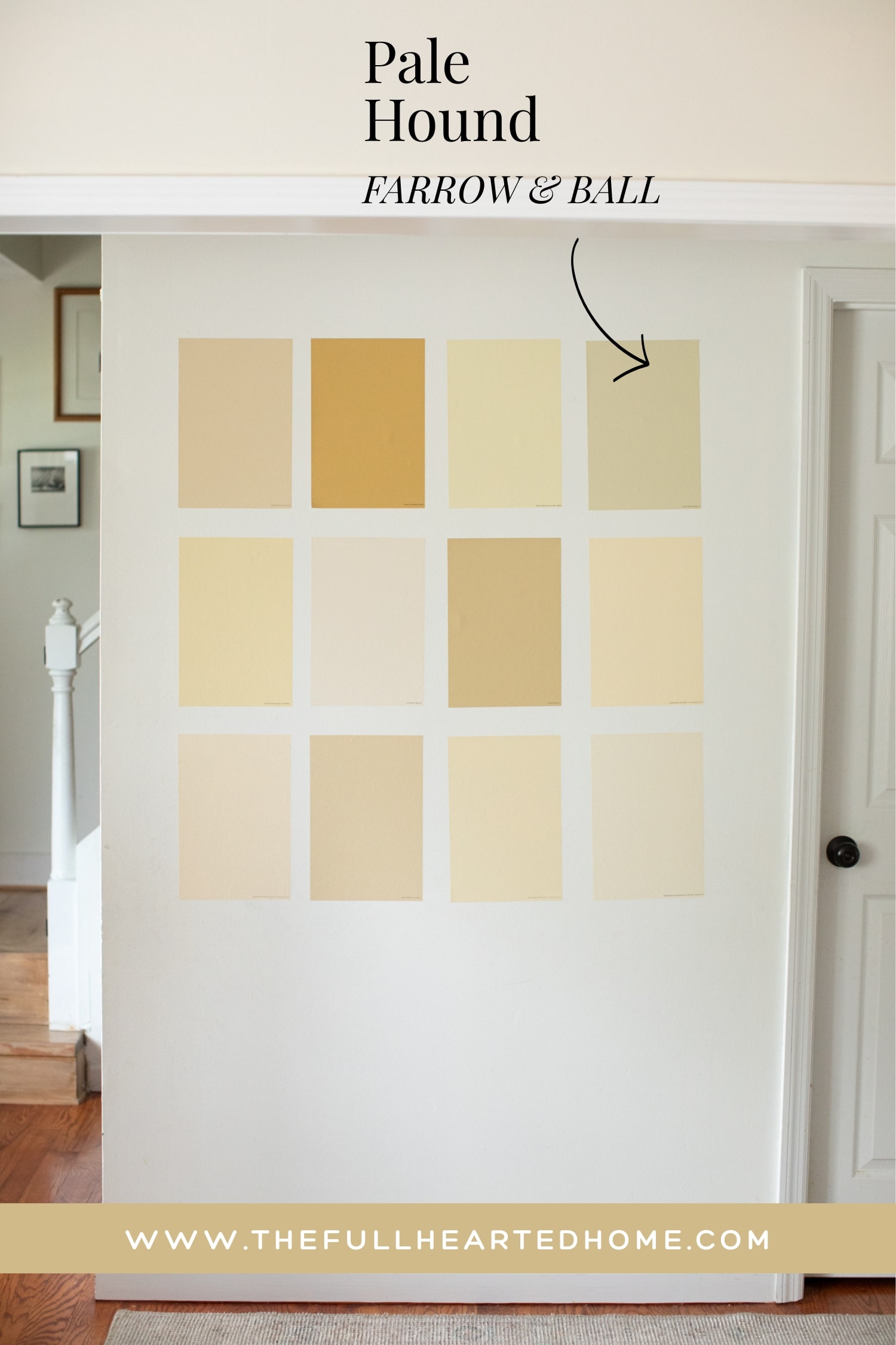

Pale Hound is almost a light green, but I think that’s what makes it so special. Unlike many butter yellows, this one has muted yellow, green, and earthy undertones that give it a sophisticated feel.
With an LRV of 71, it’s deep enough to add warmth without feeling overly bright or saturated. It reminds me of an antique European home where the paint has beautifully mellowed over time.
If you’re drawn to lighter, earthy yellows or earthy greens – Pale Hound is worth trying!
5. Banana Cream by Sherwin Williams
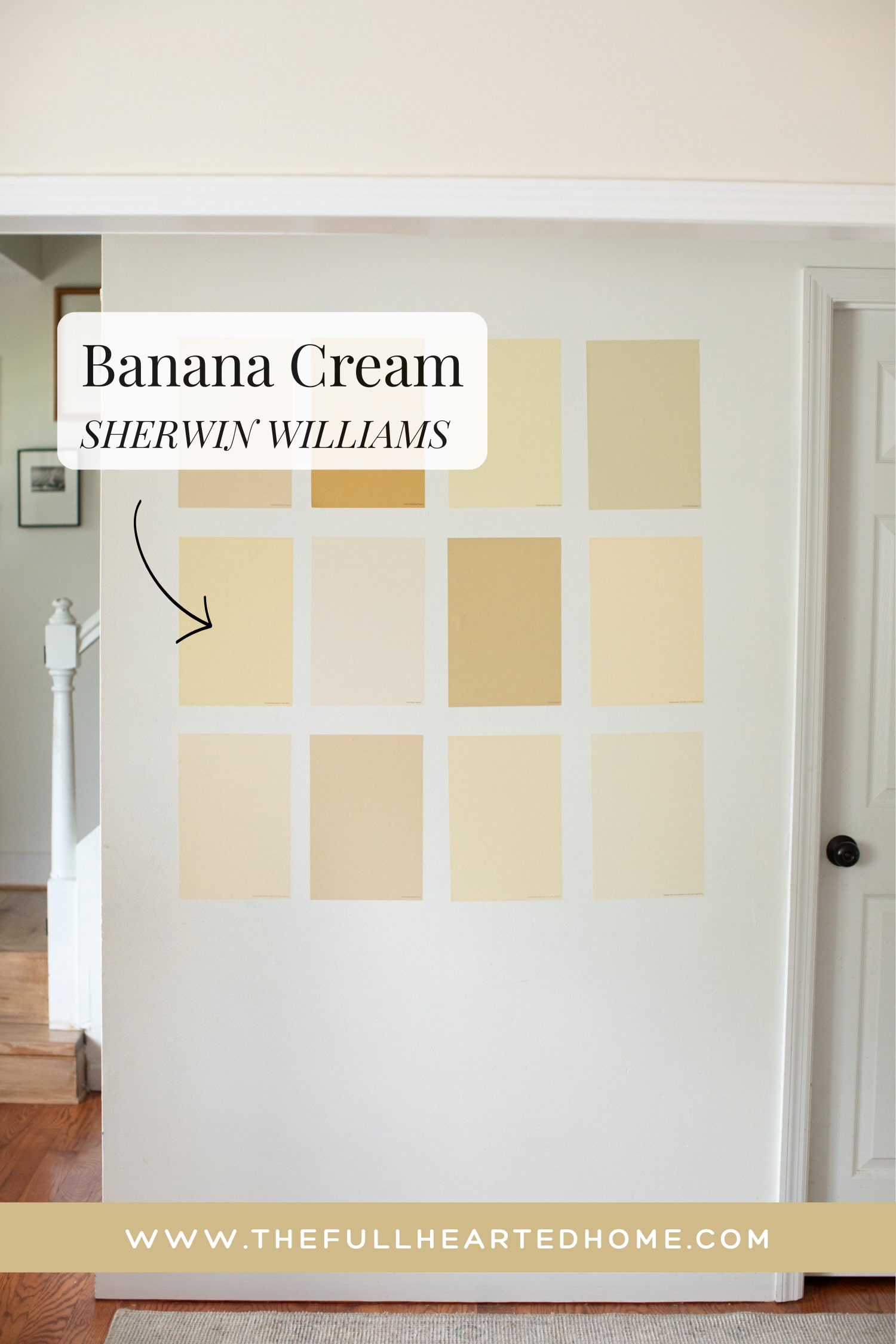

Banana Cream by Sherwin Williams is BUTTER. Out of every color I’ve rounded up, this one reads the most buttery to me. It’s a happy yellow without being TOO yellow.
With an LRV of 75, it has enough depth to feel rich and creamy without becoming overpowering. Banana Cream’s golden yellow undertones give it that soft and inviting look that is cheerful without being too bright. I could easily picture this color on kitchen cabinets or in a cozy laundry room where you want a little extra warmth.
If your goal is a true and happy butter yellow, Banana Cream is a color I’d try out!
6. Tallow by Farrow & Ball
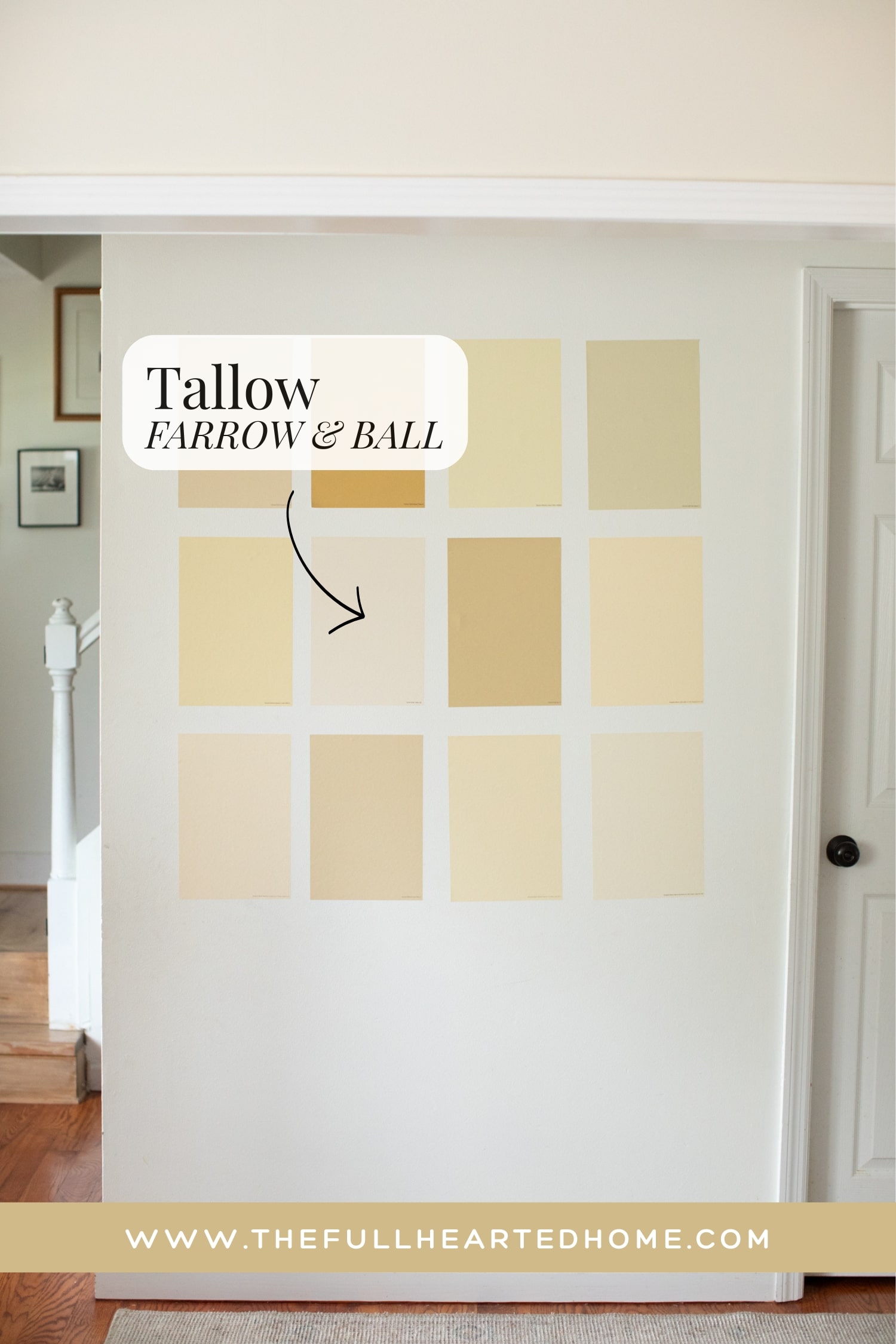

Tallow is the lightest yellow I sampled, and I know it doesn’t look especially warm when it’s sitting next to these richer butter yellows. BUT, on its own, it actually is warm and yummy paint color. This is my strongest recommendation for someone who wants light warmth without a yellow commitment.
With an LRV of 87, Tallow is bright and airy, making it a beautiful choice if you want a subtle buttery warmth. It has soft cream, yellow, and pink undertones that help it to feel elegant, in my opinion. In my home, those pink undertones definitely peeked through, making it almost read as a warm ivory.
If you’re looking for the lightest, most understated option in this roundup that still gives beautiful warmth, meet Tallow!
7. Hay by Farrow & Ball
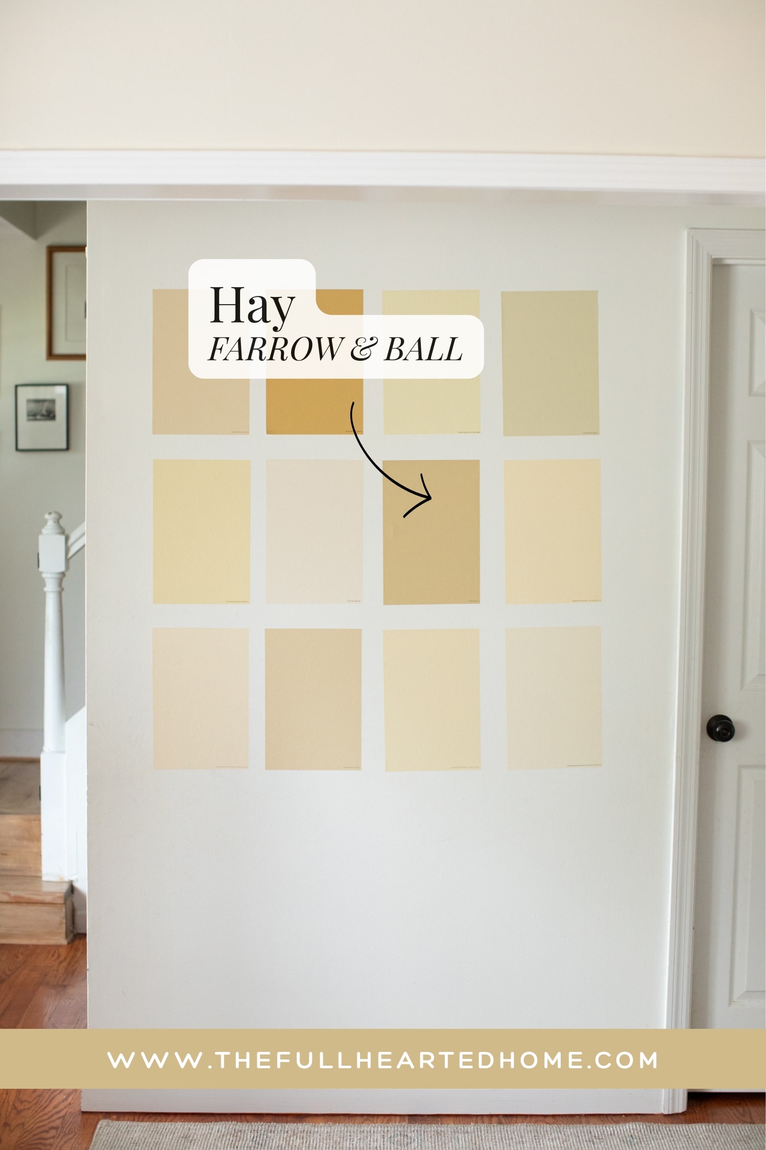

Hay by Farrow and Ball is by far the most popular shade of butter yellow that I sampled. I have seen this color EVERYWHERE. I actually wasn’t expecting it to read as brown as it does, but I think that’s why it’s SUCH a popular shade of yellow. It gives the feel of yellow but with aged charm.
With an LRV of 53, it’s one of the deepest colors in this roundup. It has enough depth to become the focal point of a room, but also feels very timeless. Its warm golden and brown undertones give it an aged, vintage look. In my opinion it brings all the warmth of a butter yellow, but in a much richer, moodier way.
If you want a moodier butter yellow, Hay may be your color!
8. Buttermilk by Benjamin Moore
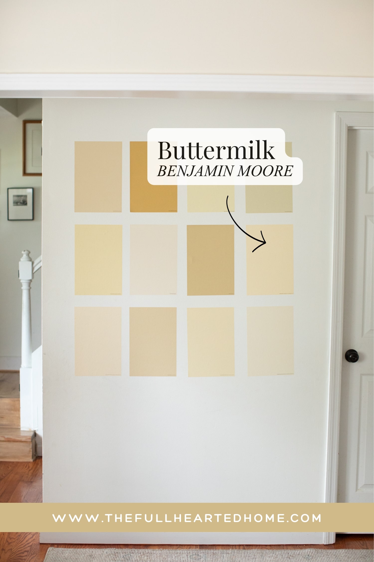
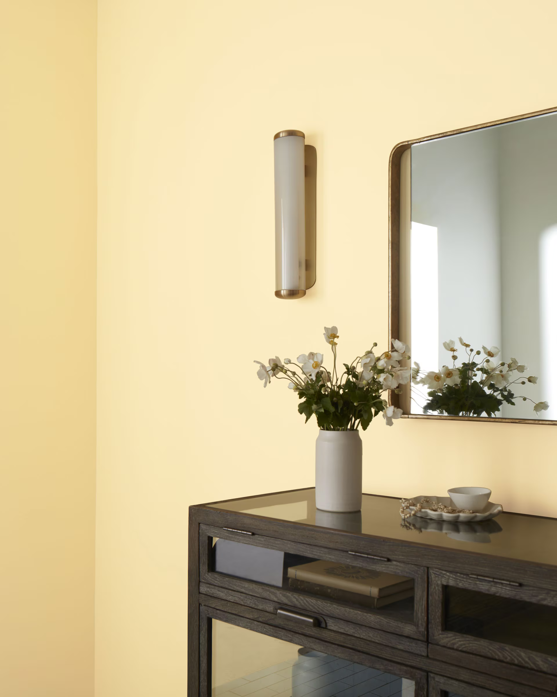
Buttermilk by Benjamin Moore is the most saturated of the lighter shades I sampled, with a very happy, bright, and fresh feel. It has an LRV of 75.86, so it will brighten a room and feel like sunshine.
Its soft yellow and beige undertones give it a warm look without going TOO bright sunshine yellow. Buttermilk would be beautiful in any room you use it in. I personally think it could be such a fun laundry room color. But living rooms, kitchen cabinets, bright dining rooms, etc. This beauty will show up and show out!
If you’re looking for a paint color that gives off a “homemade and happy” feel, Buttermilk is a great choice.
9. Man on the Moon by Sherwin Williams
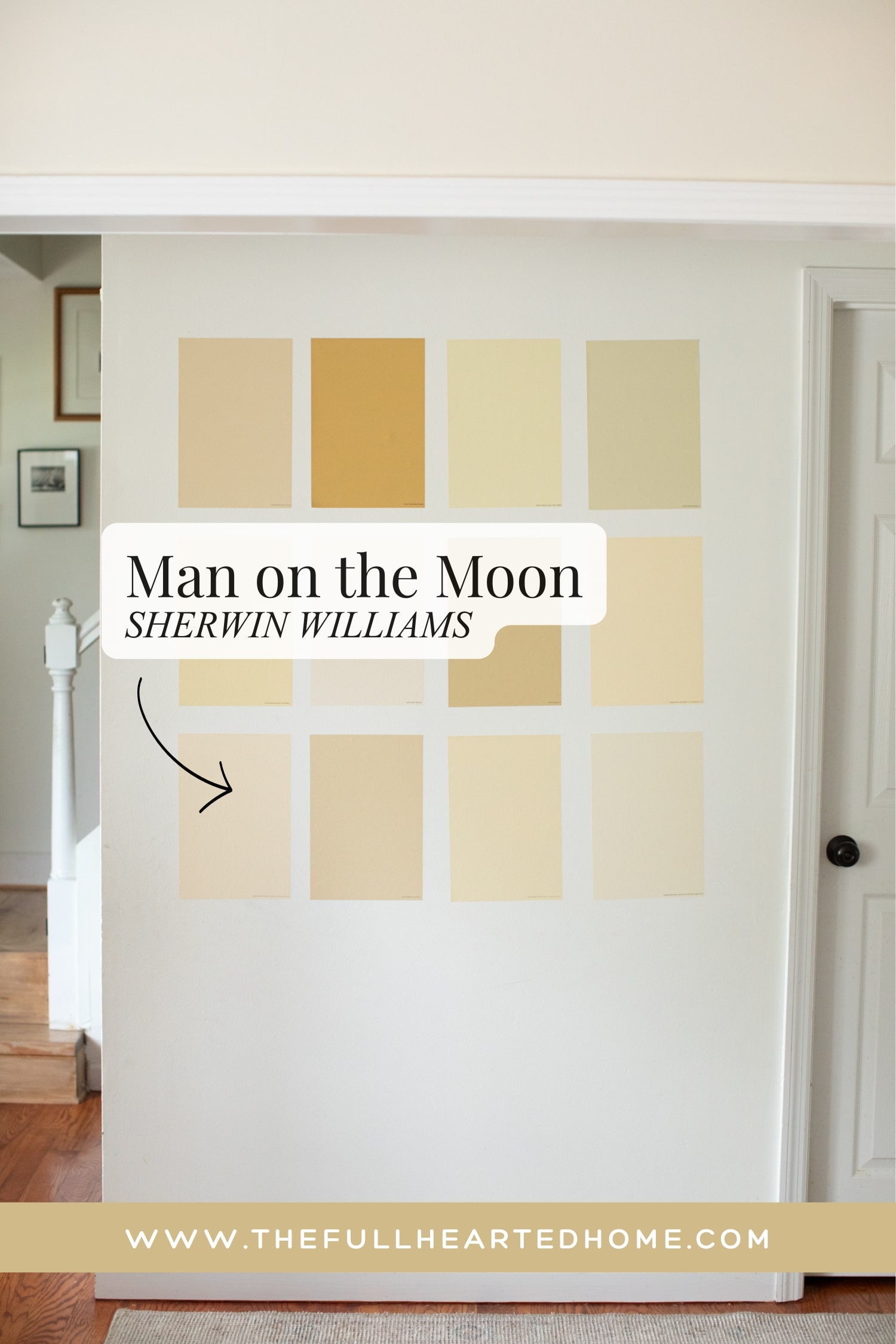

I’ve seen Man on the Moon in lots of suggested yellow paint colors lists, but I’ve not seen many photo examples of it used. This color is so stunning, happy, and elegant in person that it’s my personal opinion that we will be seeing a lot more of it this year. This is one of my favorite options for anyone who wants a warm, muted color with timeless appeal.
Man on the Moon has a quiet warmth that doesn’t immediately scream “yellow,” making it perfect if you’re looking for a warmth that is more subtle. With an LRV of 80, it reflects a good amount of light while still adding a creamy glow to a room.
Its warm yellow, cream, and subtle beige undertones keep it feeling calm and sophisticated rather than bright or playful. If you love the idea of butter yellow but want a shade that leans more timeless and neutral, Man on the Moon may be the right fit for you.
10. Ivoire by Sherwin Williams
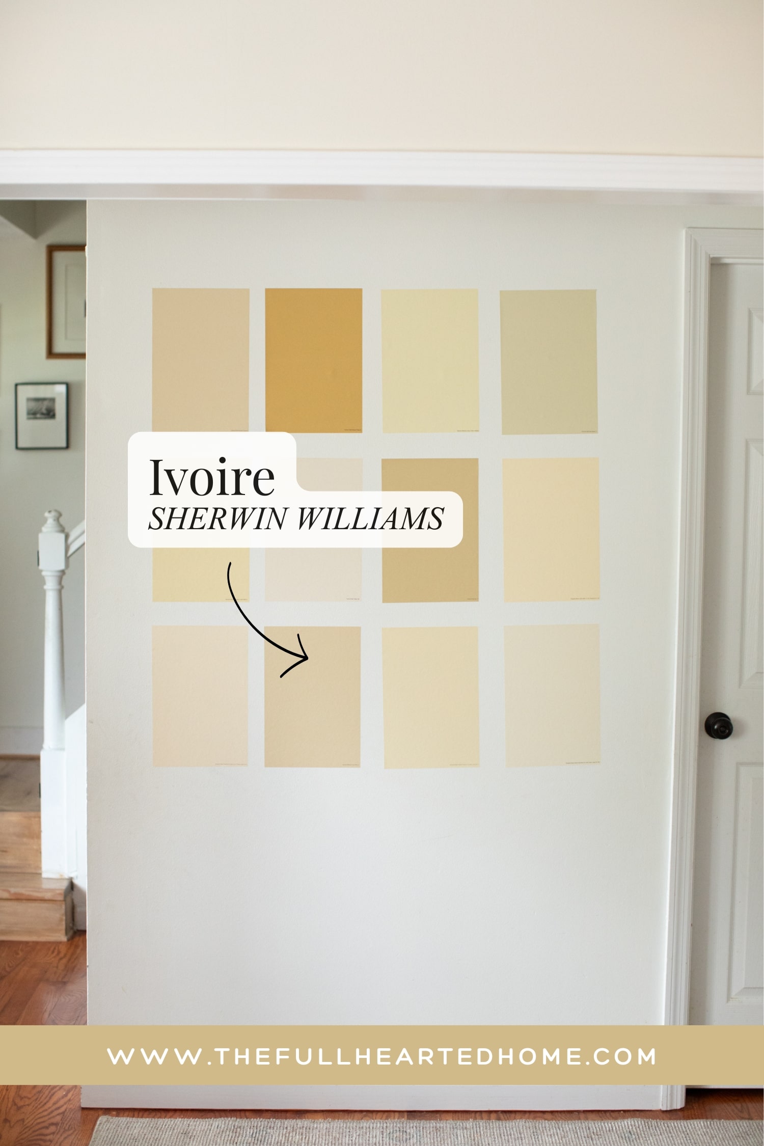

Ivoire is Hay-reminescent to me, but lighter and with less yellow undertones. With an LRV of 79, it’s light and airy while still wrapping a space in warmth. Ivoire has soft yellow, cream, and beige undertones that create a buttery look without the bold yellow.
Ivoire is the color you might choose if you want people to walk into the room and say, “This feels warm,” without immediately seeing yellow!
11. Weston Flax by Benjamin Moore
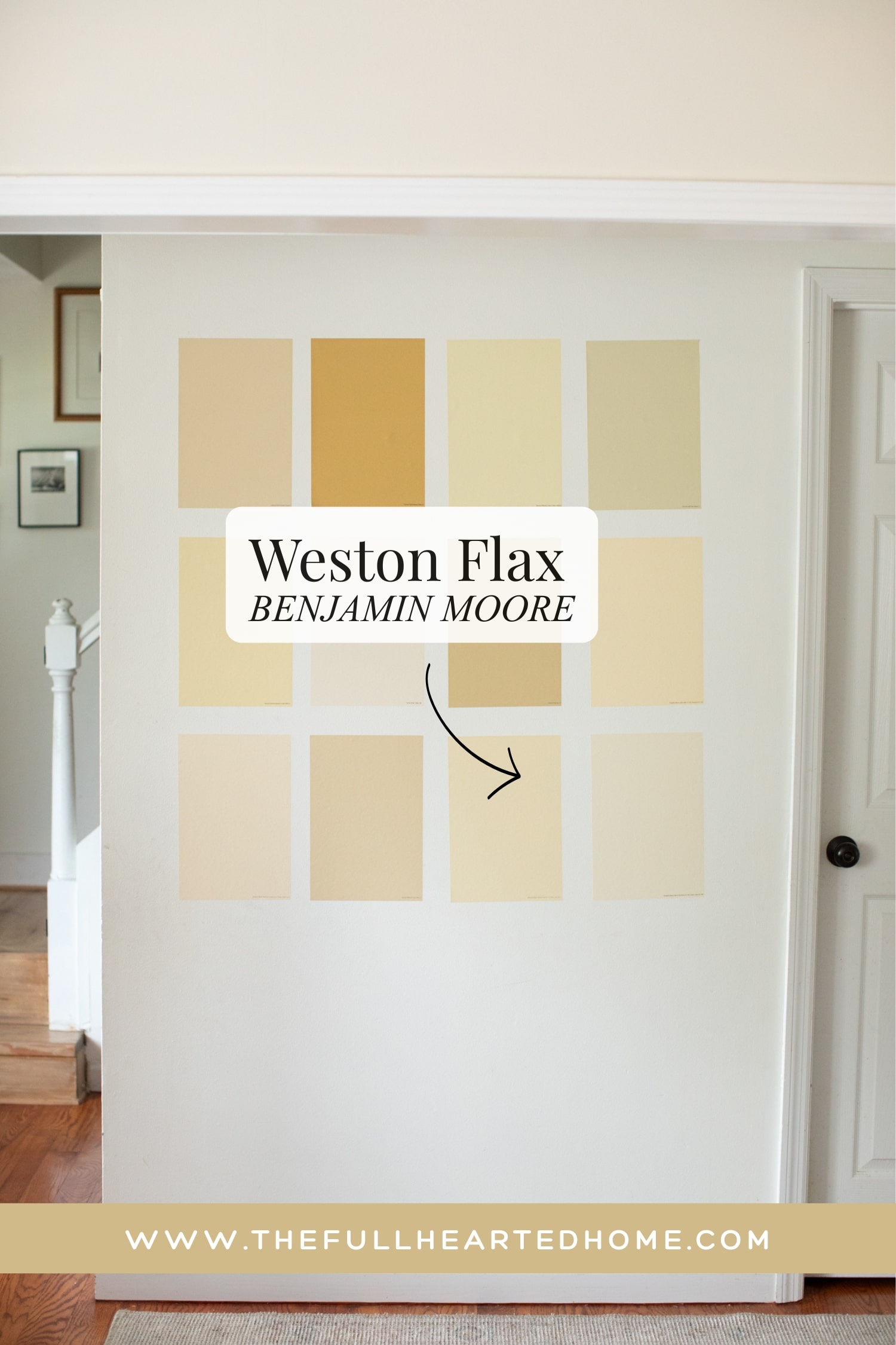
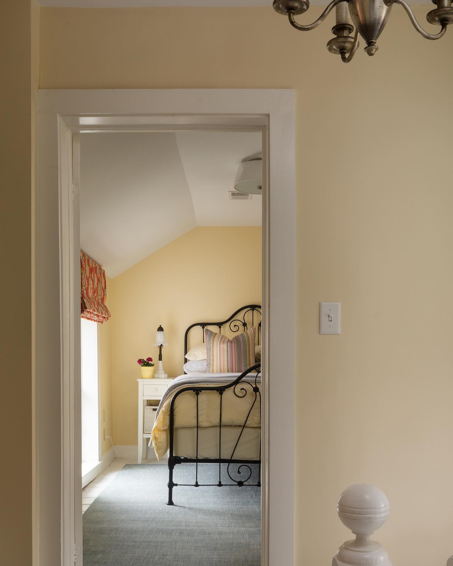
Benjamin Moore describes Weston Flax as “a classic option for those searching for the perfect buttery yellow.” I find this to be very true! I stated earlier that Banana Cream was the most butter yellow that I sampled, and I stand behind that. But Weston Flax is its lighter, slightly more neutral cousin. It is a beautiful balance between some of the brighter yellows and other creamy shades.
With an LRV of 76, Weston Flax allows a room to feel bright while still grounded and buttery cozy. Its golden yellow and warm beige undertones give it a mellow, lived-in feel that’s rich without being overpowering. If you’re looking for a true butter yellow that’s soft and understated, Weston Flax is a great option!
12. Windham Cream by Benjamin Moore
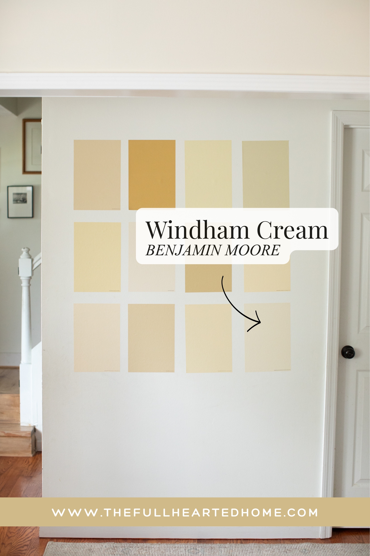

Windham Cream is the second to lightest shade I sampled (the first lightest being Tallow). Benjamin Moore describes Windham Cream as a “a sunlit, luscious cream color with a whisper of peach.” This is a perfect description. Compared to Tallow, Windham Cream is richer and more butter yellow.
With an LRV of 79.59, it will be light and airy while still giving a buttery warmth. Its soft yellow, cream, and beige undertones create a cozy color that’s noticeable without being overpowering.
If you love the idea of butter yellow but are worried it might be too bold, Windham Cream is a color to try!
To sum this up, there was not one single paint color that I compared here that I wouldn’t use. They are all THAT good.
So to make this easier for everyone, I’ve put together a quick decision guide below!
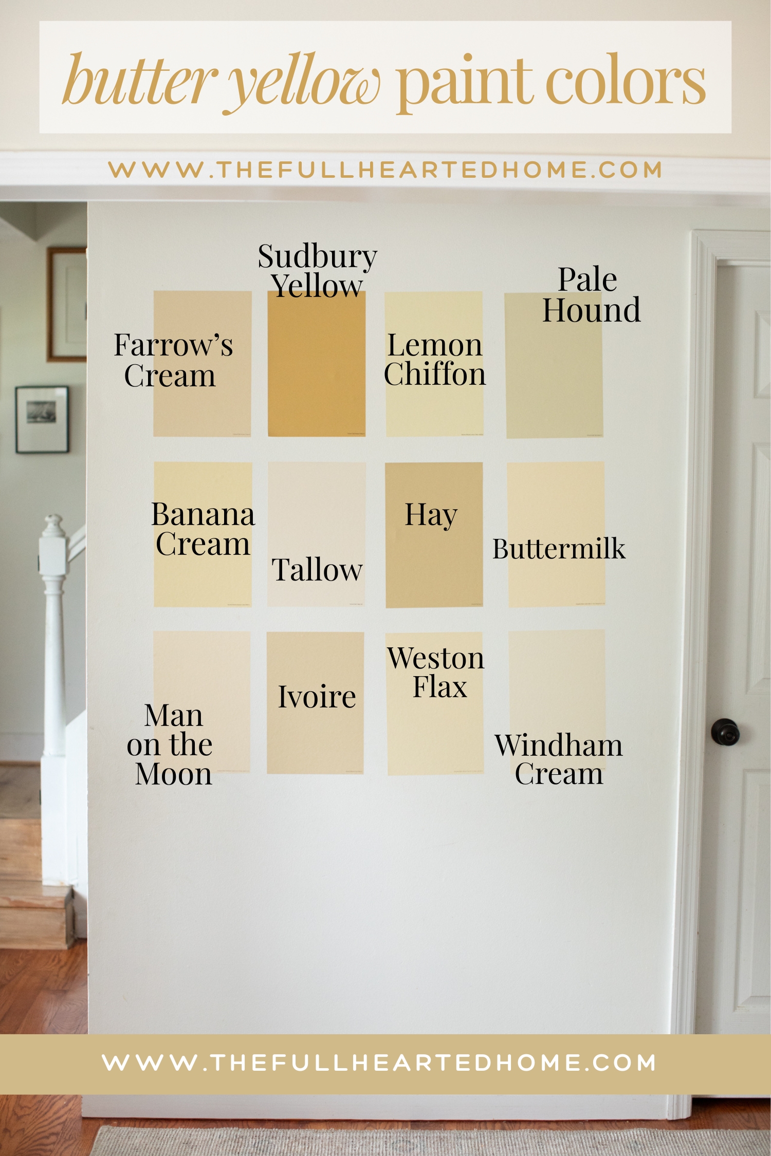
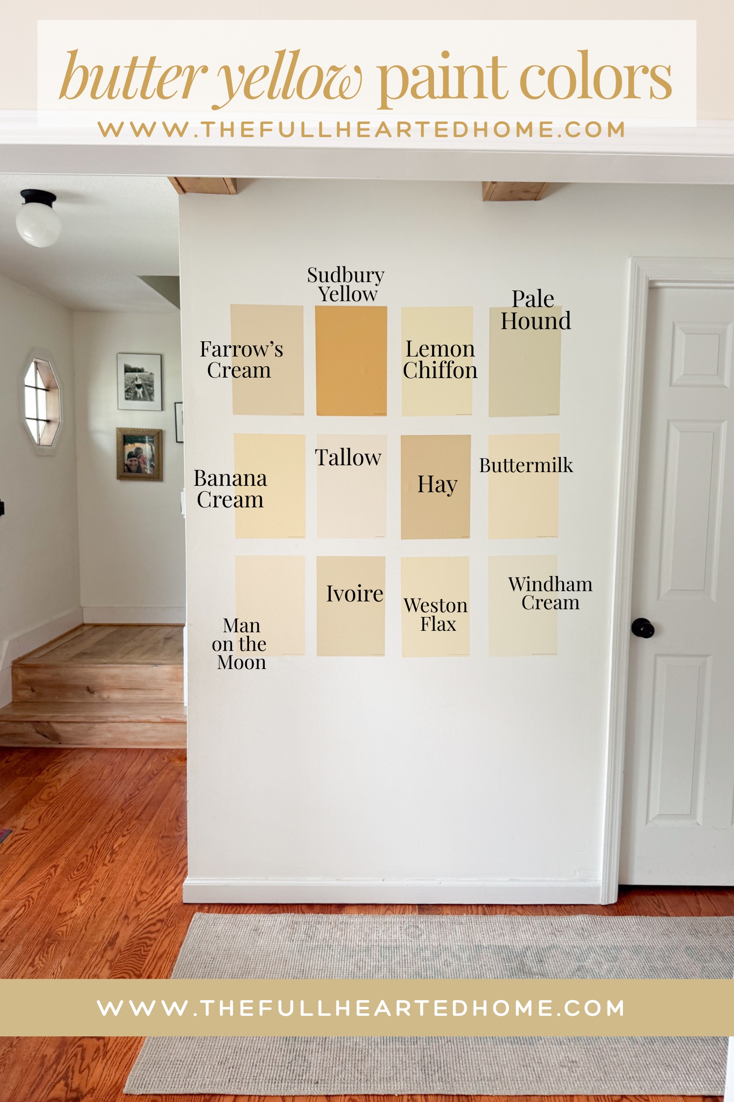
Which butter yellow paint color is right for me? Here’s a quick decision guide!
Whether your personal style leans cottage, traditional, or timeless, here’s where I’d start.
I hope seeing these popular butter yellow paint colors side by side has made your decision just a little bit easier! It’s amazing how different they can look once you compare them in the same light.
AGAIN, my biggest piece of advice is to order samples from Samplize of your favorites and live with them for a few days before making your final decision. Paint has a funny way of changing throughout the day, and what looks perfect online may surprise you in your own home.
Happy painting, friends! I can’t wait to see which butter yellow you fall in love with!
Courtney
SAVE THIS PIN FOR LATER: